FLAVOURS REFRESH

Turning flavour confusion into a world with personality
Brand World Exploration and Execution | 2026
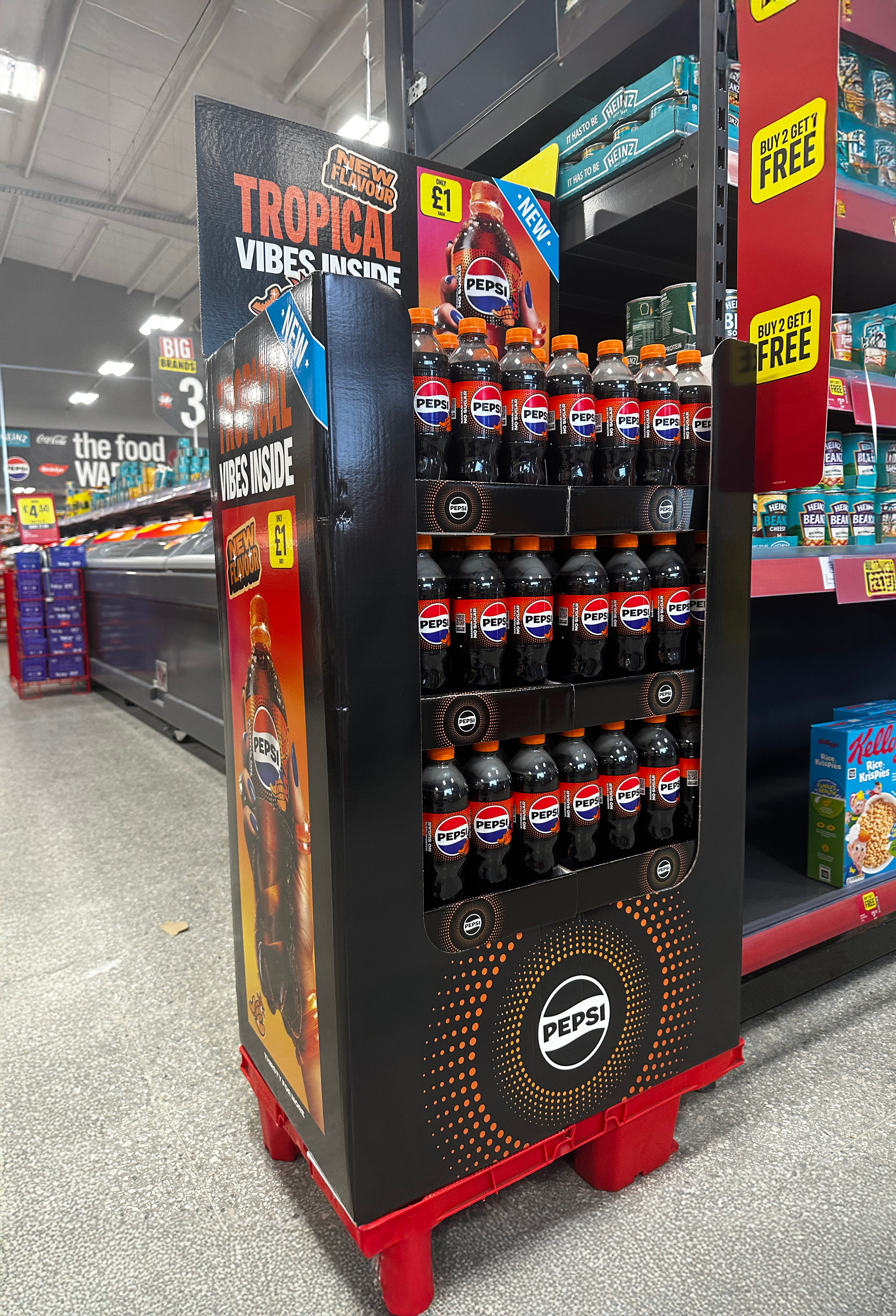
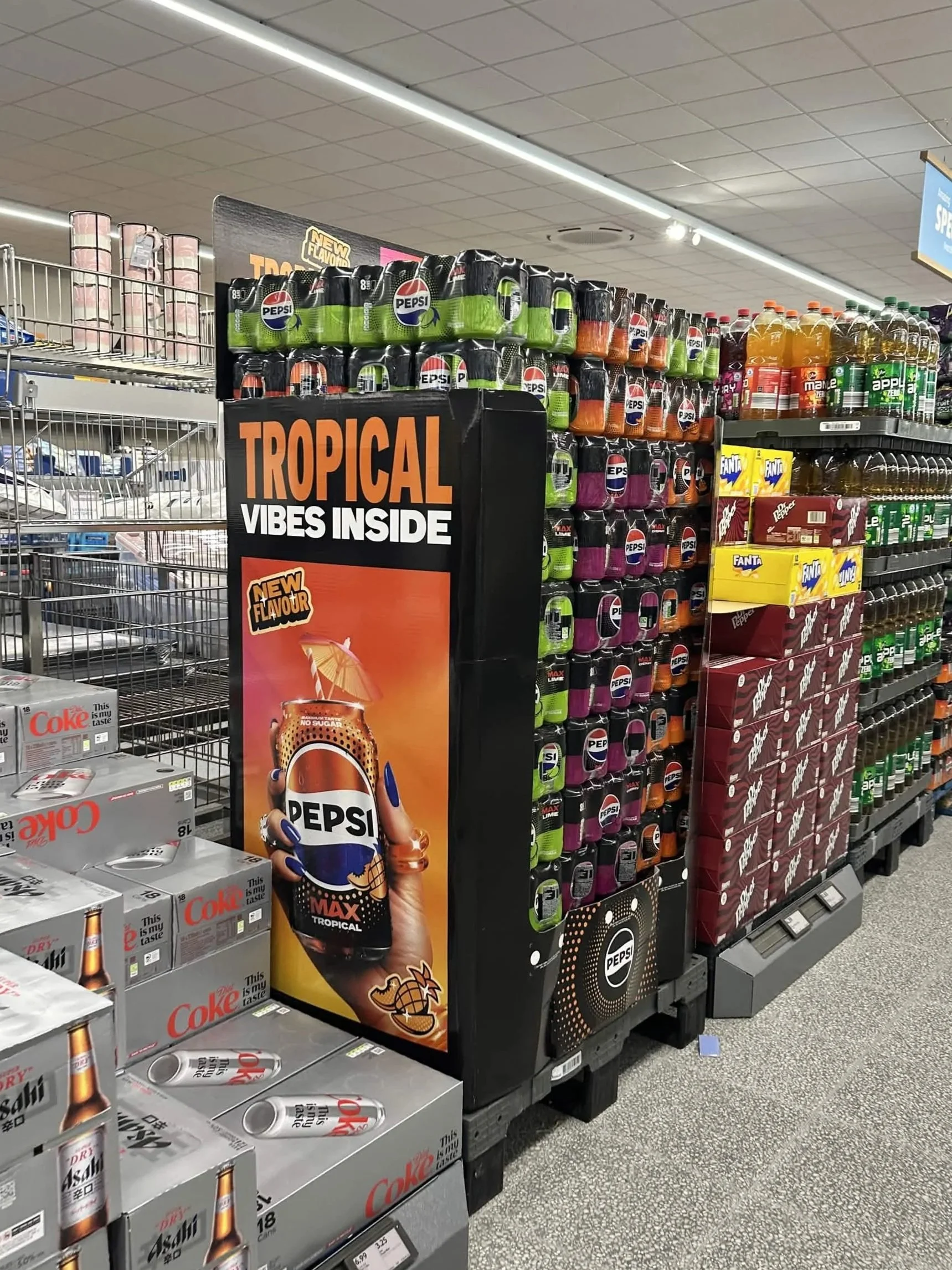
The previous UK Flavours range struggled with flavour navigation and shelf impact. One issue was that the “globe/dot” device used in place of fruit cues (due to stricter local constraints within the UK) was being read by consumers as generic “polka dots,” reducing clarity and recognition. The packaging refresh meant they needed a new Flavours world that felt unmistakably Pepsi while giving each flavour a stronger, more confident personality when stood alone.

My Role
This was a large, multi-designer project with many contributors and stakeholders. As a key contributor, I supported development and execution of the Flavours campaign world by:
• Proposing and refining options for the brand world and flavour personalities
• Designing how the world would come to life across key visuals and shopper applications
• Contributing to sticker device design and placement decisions
• Supporting the shopper toolkit + renders approach
• Writing the motion brief and storyboard, guiding composition, transitions, sound direction and creating supporting motion assets.
• Art directing lifestyle photography, providing props/material/lighting references and shot intent
• Developing the brand world for the new flavour, Pepsi Tropical
(Packaging was initially developed with an external partner; I supported decision-making through shelf mockups and application considerations rather than leading packaging design.)
Brand World Explore
Concept 1 | Bold Flavour Burst
The campaign assets use a deliberately human, sketch-like visual language to create an open, participatory tone. Illustrated symbols function as conversation starters rather than definitive statements, and are paired with Fave Script Bold Pro to visually connect the typography to the illustrative style. This LTO typeface is used alongside the brand’s core type to maintain strong Heineken brand recognition.
The symbols are drawn using a continuous-line art brush at 0.5pt, reinforcing the idea of an ongoing conversation and reflecting the personal, evolving nature of individual perspectives on each topic. Each
Concept 2 | Redefined Refreshment
The campaign assets use a deliberately human, sketch-like visual language to create an open, participatory tone. Illustrated symbols function as conversation starters rather than definitive statements, and are paired with Fave Script Bold Pro to visually connect the typography to the illustrative style. This LTO typeface is used alongside the brand’s core type to maintain strong Heineken brand recognition.
The symbols are drawn using a continuous-line art brush at 0.5pt, reinforcing the idea of an ongoing conversation and reflecting the personal, evolving nature of individual perspectives on each topic. Each key visual features a handwritten prompt filling the blank “_____” space
Concept 3 | Modernised Farmers Market
Taking inspiration from semiotics of fruit stickers, this route leans into the farmers market aesthetic with a modernised Gen Z lens.
Chosen Concept
Senior stakeholders chose to go with option one as it felt most similar with the rest of the global flavours standards and most evergreen design. The execution of the stickers from concept 3 was liked and felt like it could be executed in a similar way that the global flavours key visuals are used so this was added in. The concept of refreshment was interesting, so cues of refreshment were also brought into concept 1 through ice and spritz. Next step was to develop the key visual and supporting assets.
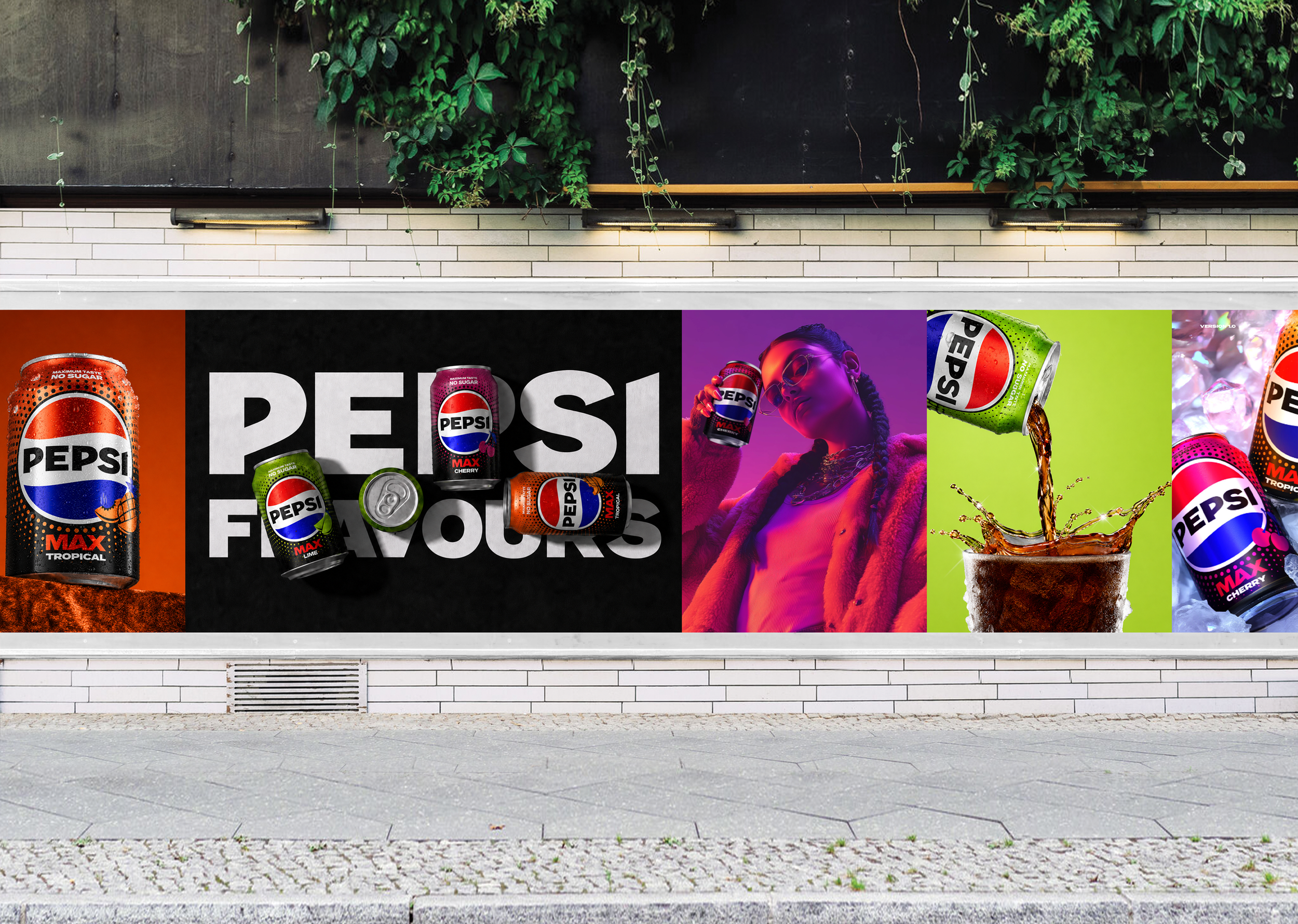
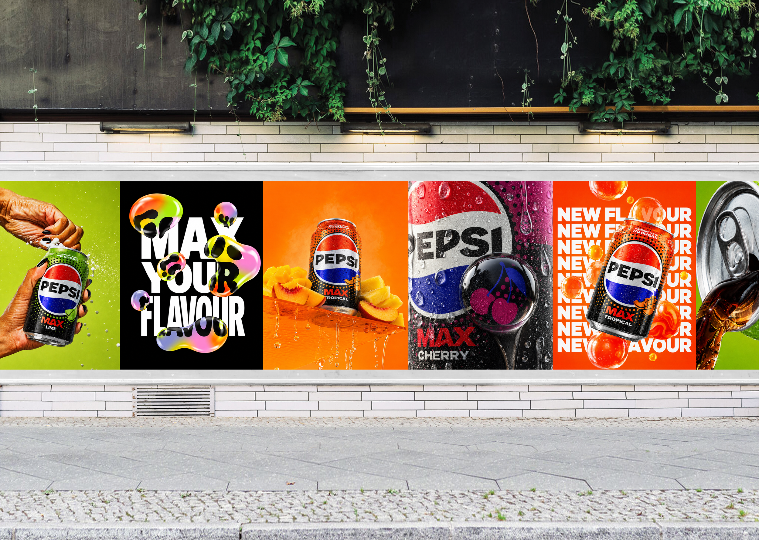
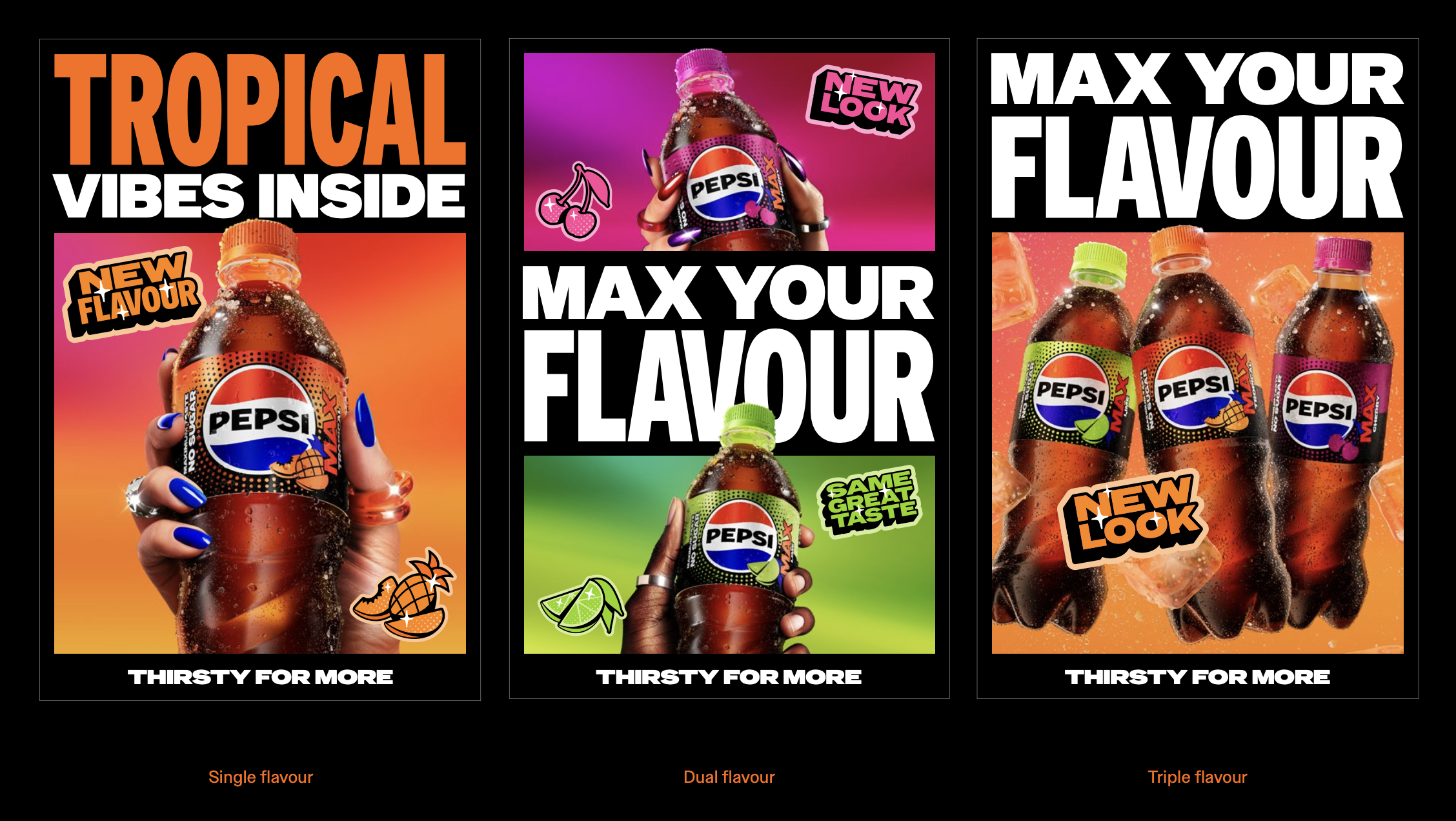
Key Visual Variant Structure

Lime
Bold, Ad
As this is the core toolkit for flavors, the key visual needed to be evergreen and extremely flexible between campaigns. Whether this is used for single flavour, dual flavour, triple flavour or if they swap for upcoming campaign headlines. For digital spaces with minimal motion such as digital banners, I developed the key visual with subtle accents which guided the viewer across the design.
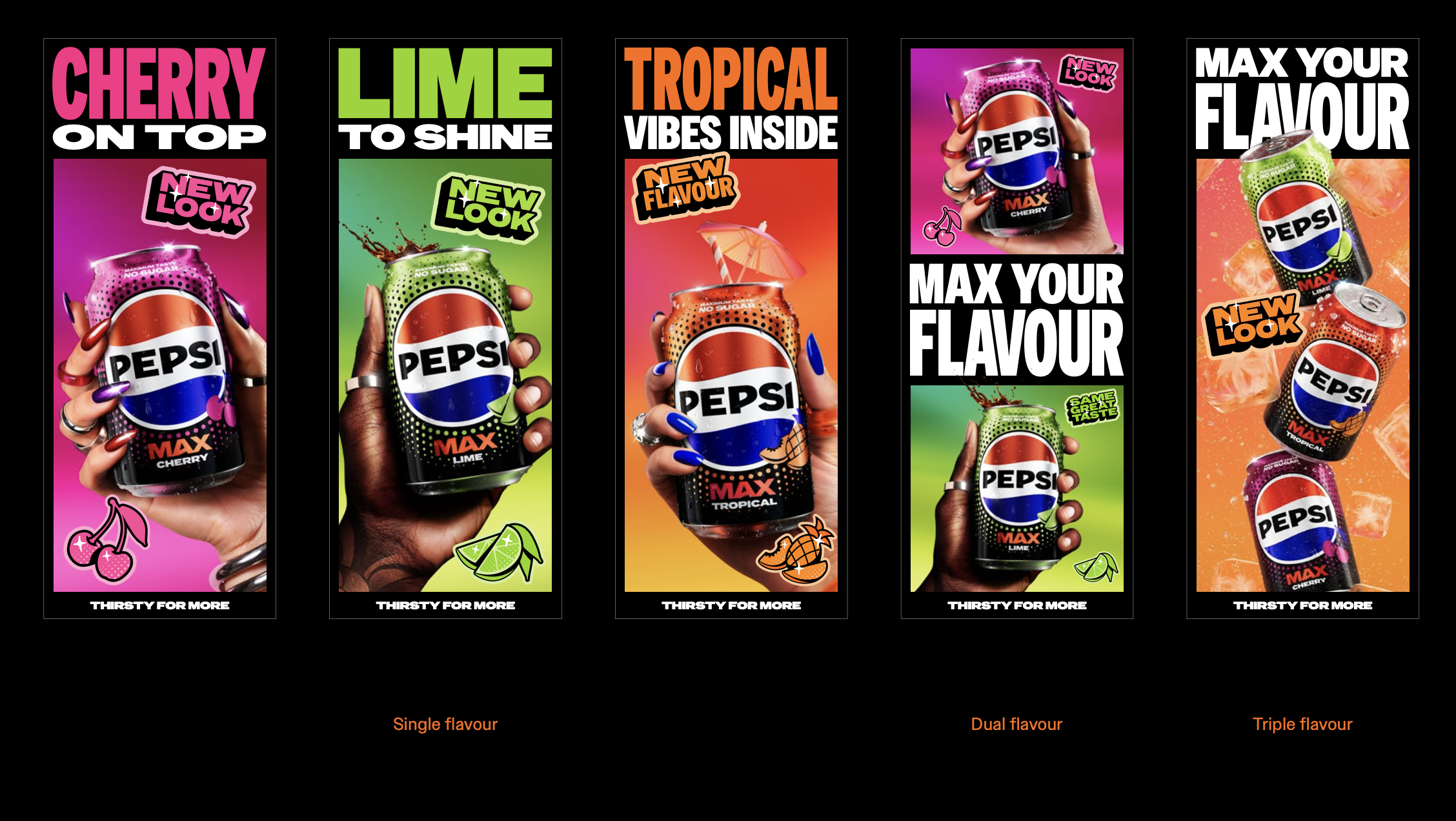

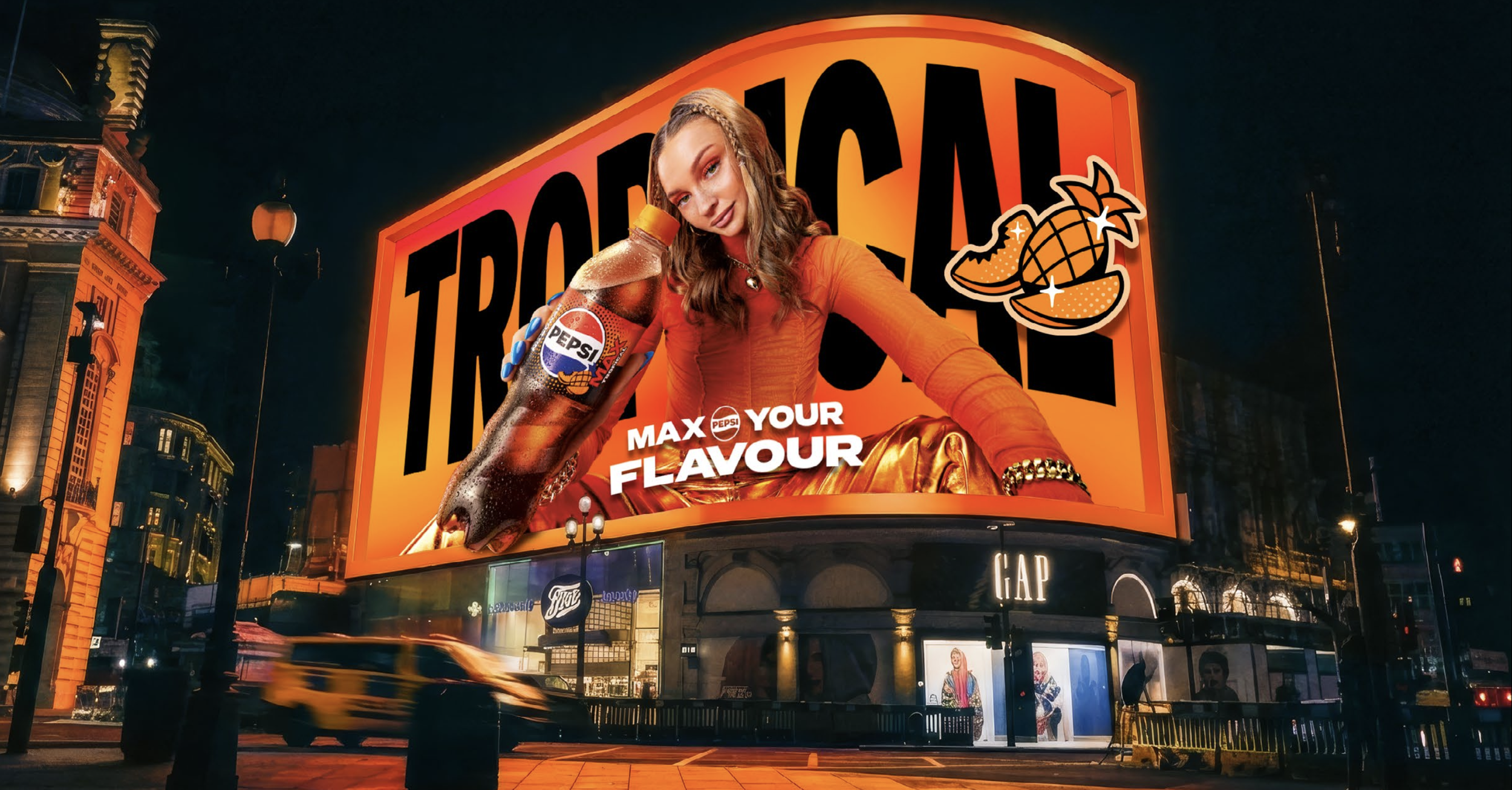
Tropical
Bold, Ad
Asset Development
Key Visual Development
Flavour Personality Strategy

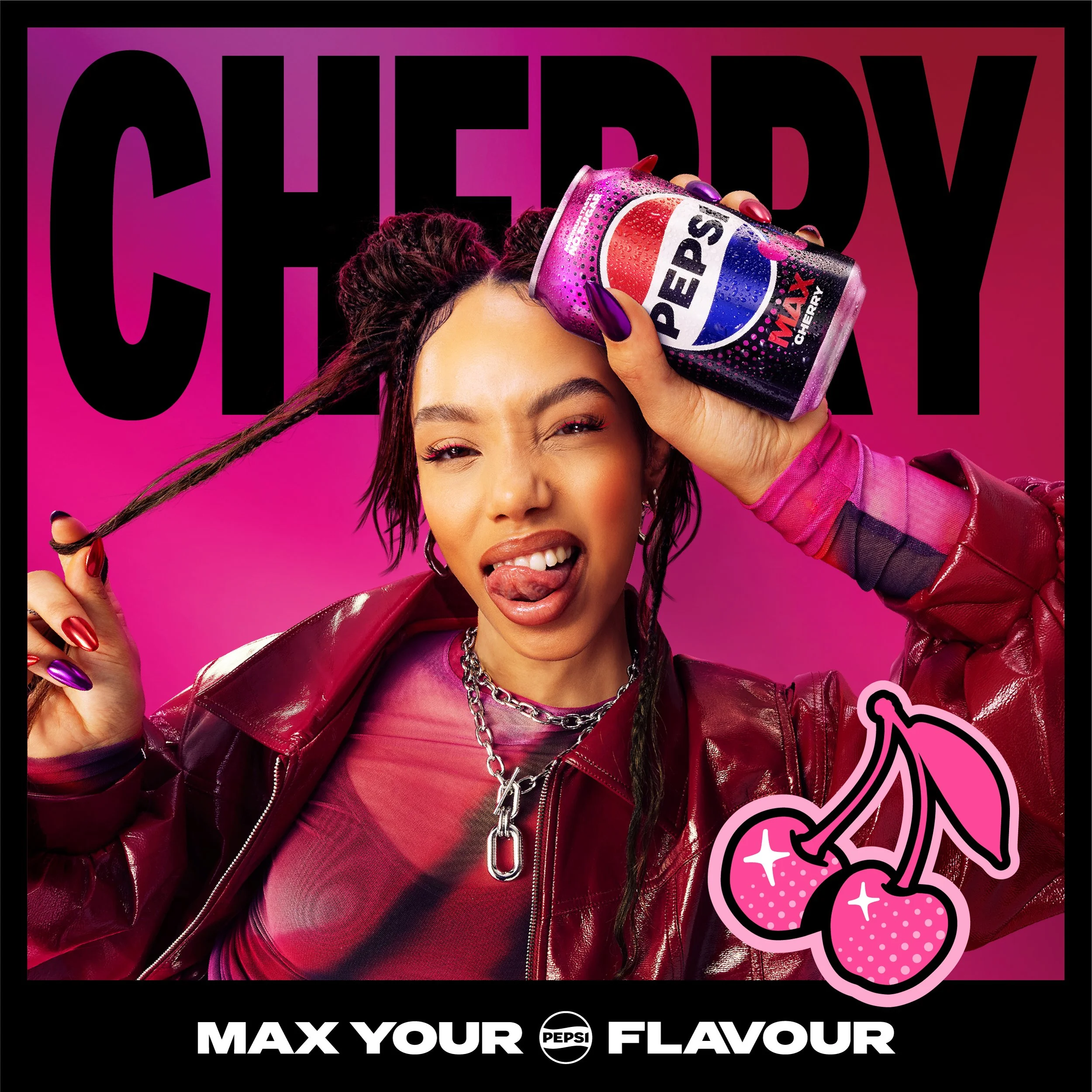
Cherry
Bold, Ad
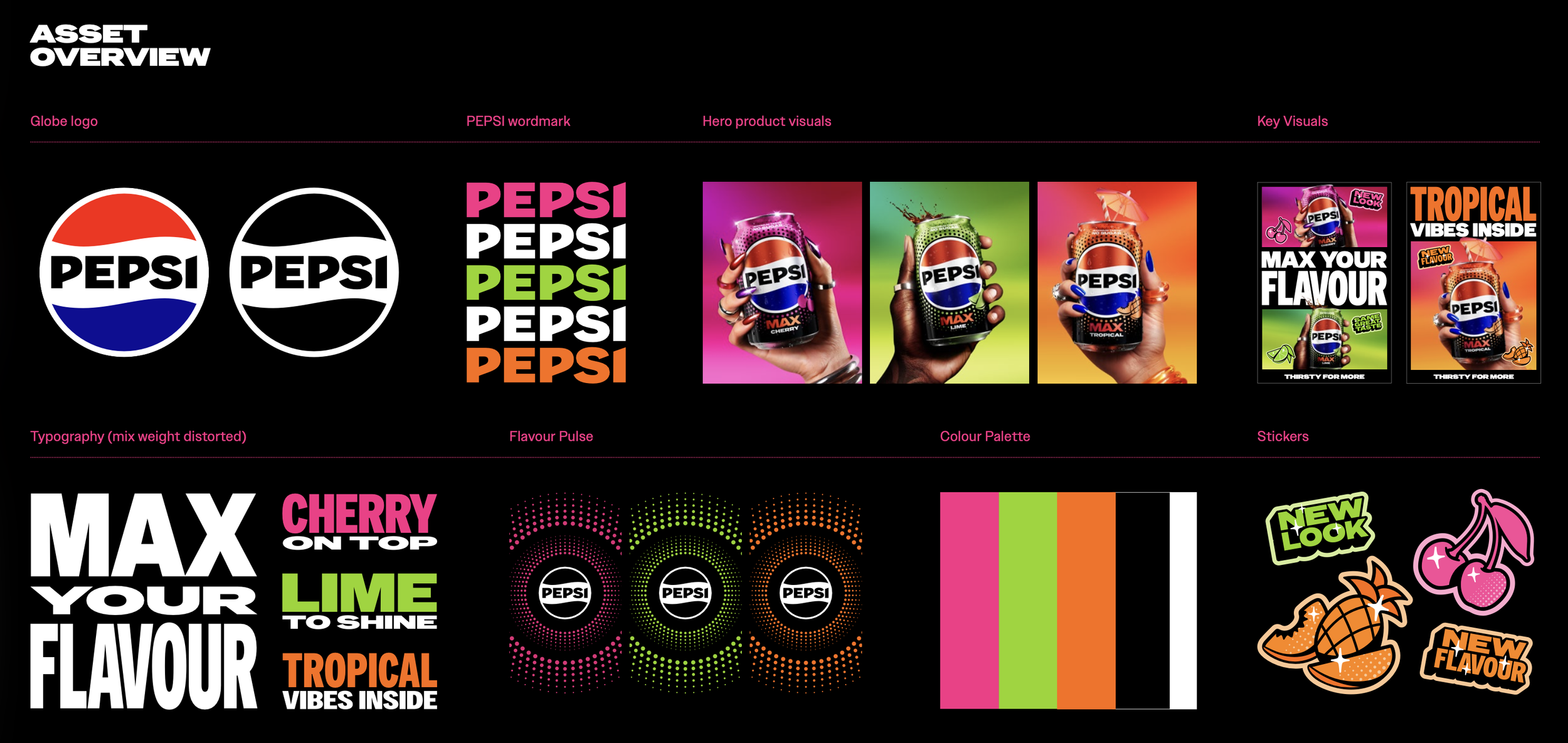
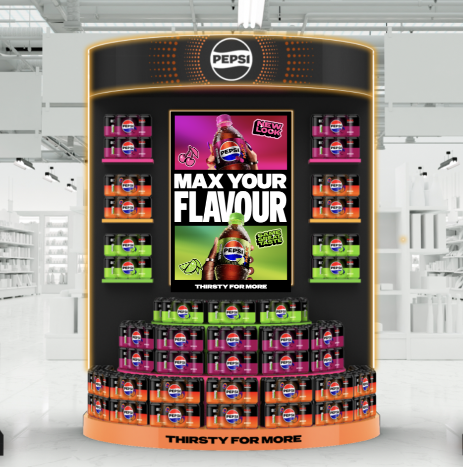
We developed the core building blocks for the toolkit using some of Pepsi Core assets such as the logos, pulses and type faces, and then developed illustrations based on the pack design. We developed the visuals by using a mixture of stock photography, 3D rendering and Ai retouching to pull the designs together in a copy-right free way.
Extended Motion Development
In collaboration with Rokabye, I designed the storyboard and gave heavy guidance to develop an adaptable piece that works in vertical and horizontal formats. The goal of the motion is to show the new packaging, the core messaging on pack and emphasise refreshment cues with spritz and ice.
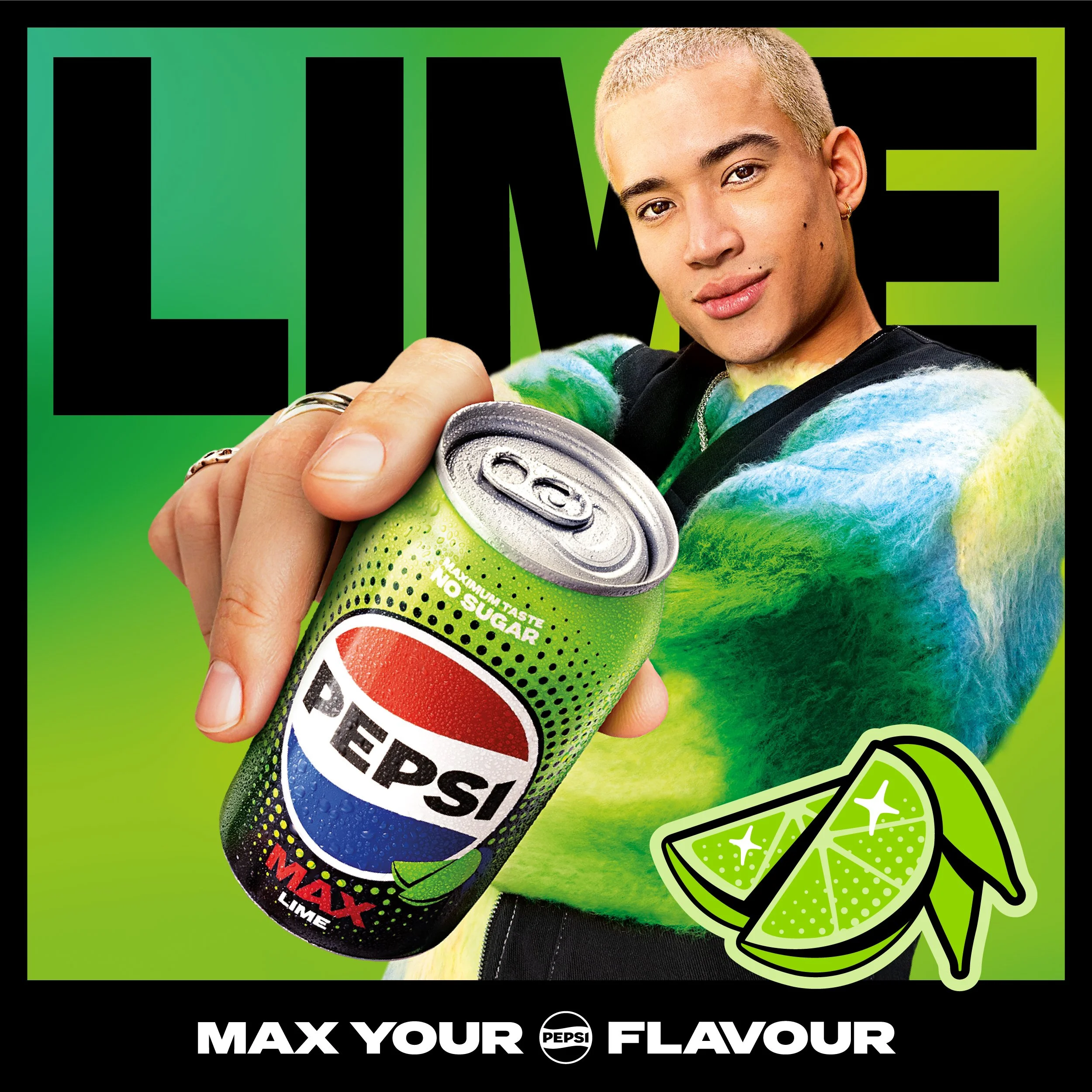
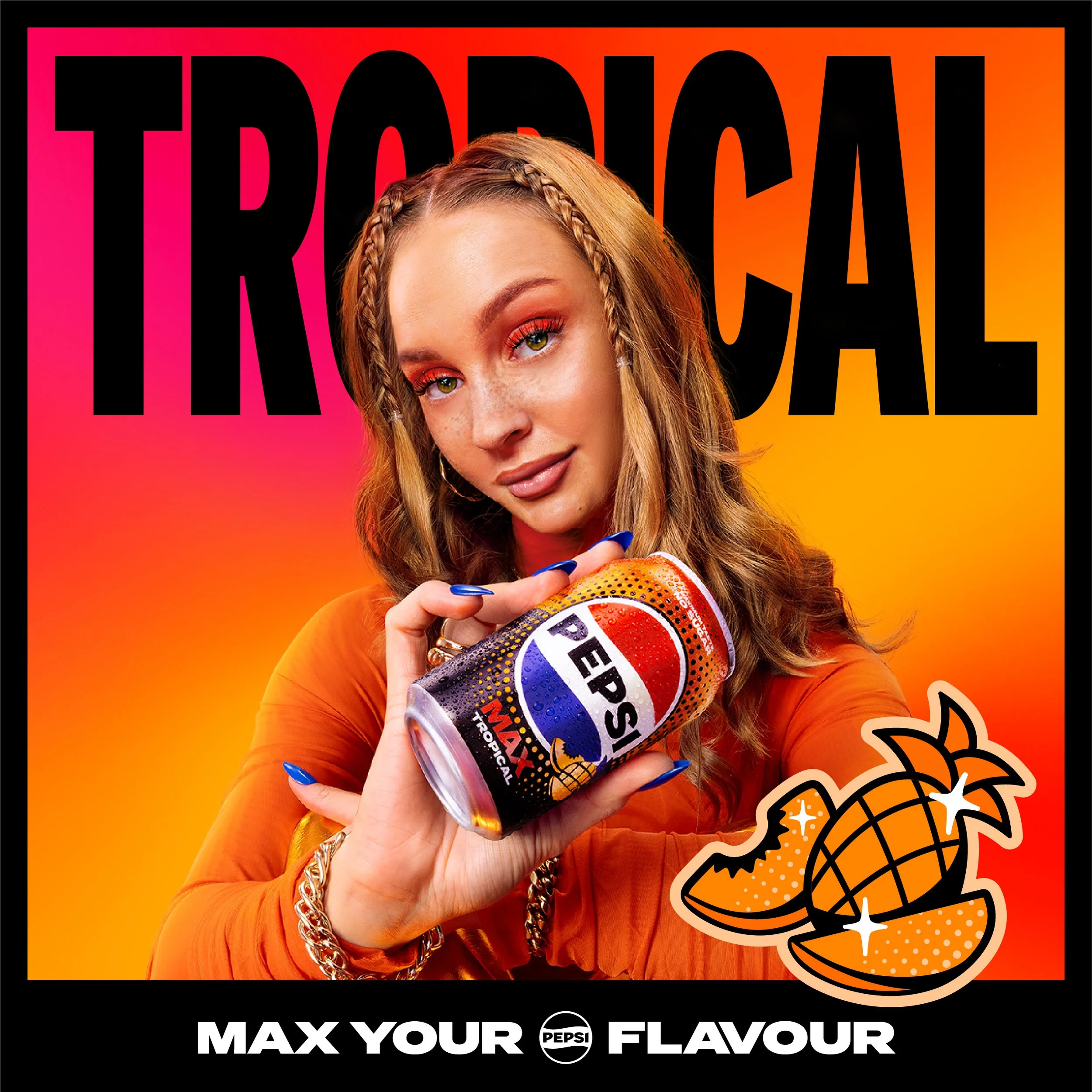
Art Direction and AI Sketches
To execute the lifestyle photoshoot, we needed to give guidance on;
Model Choices
Backgrounds
Textures
Outfits
Poses
Lighting
To do this, we created moodboards for each flavour, then developed concept sketches using software such as Gemini, Hitchfield, and Weavy to help guide the photography’s mood and direction to stay consistent with the rest of the brand world.
Lifestyle
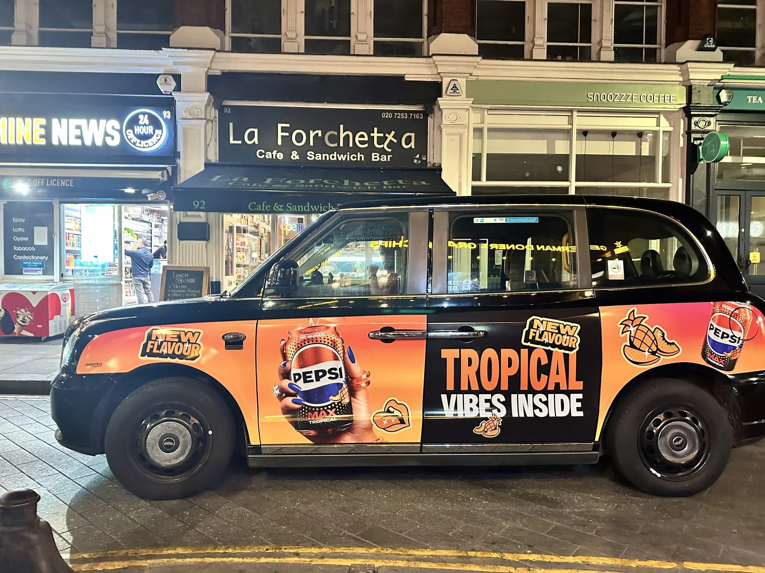
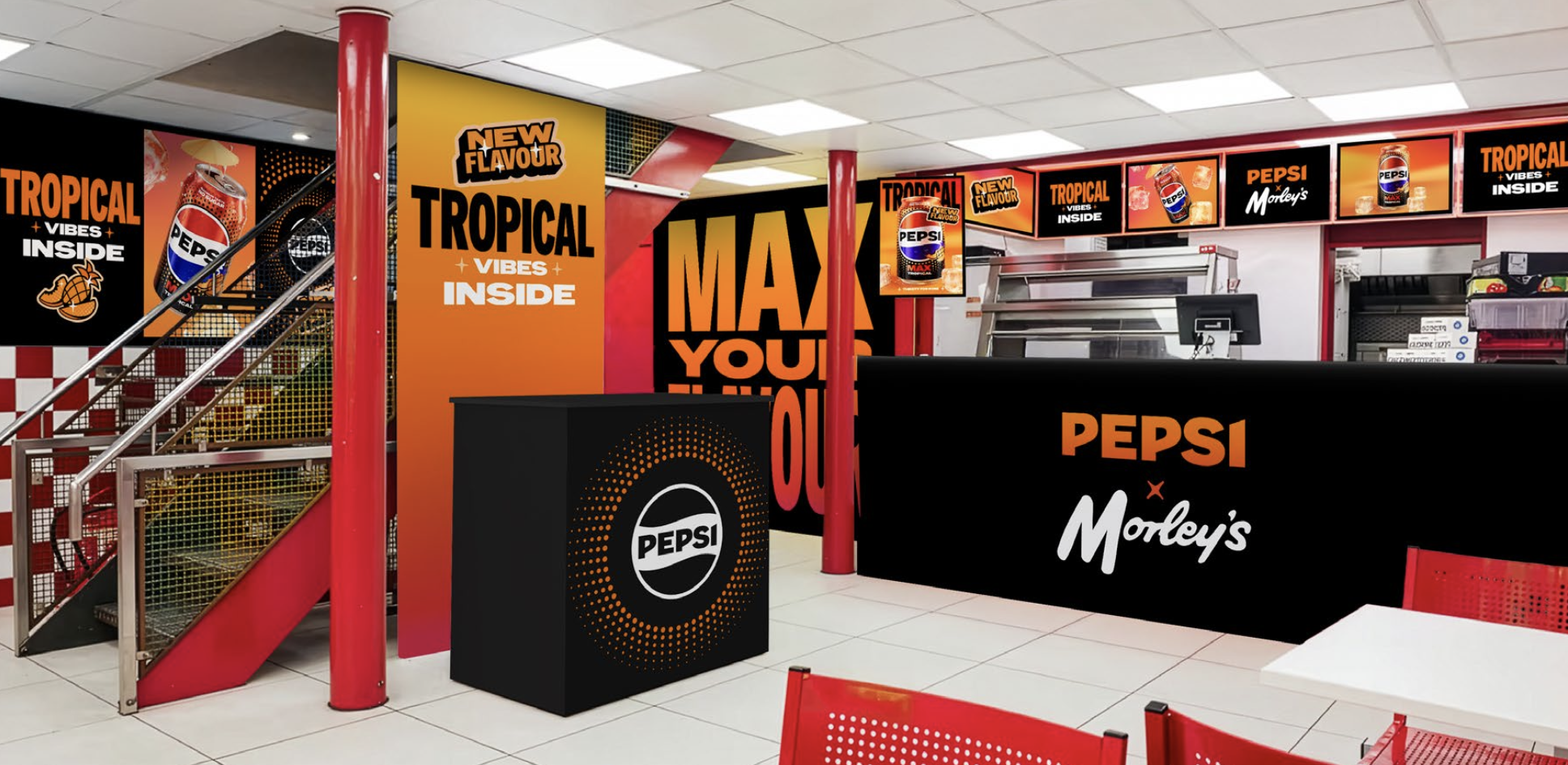
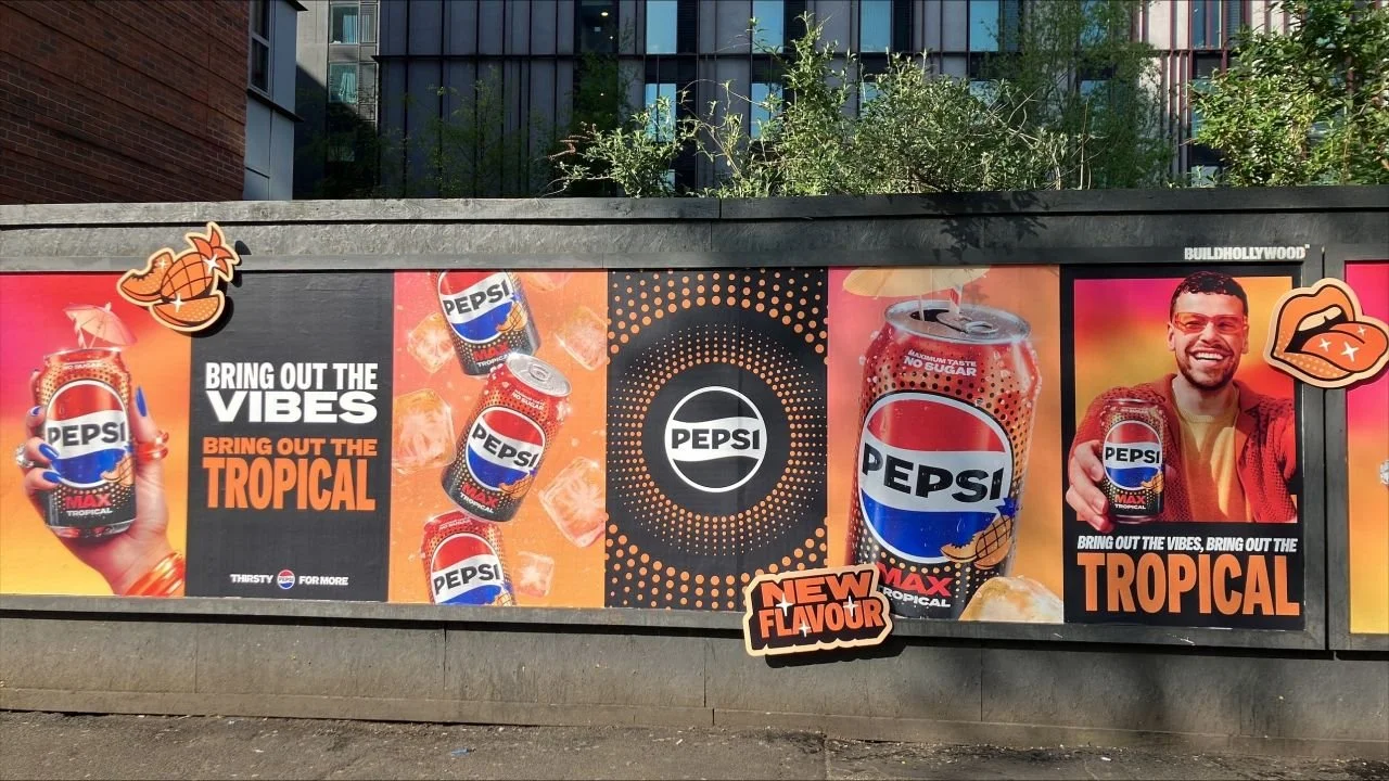
Experiential
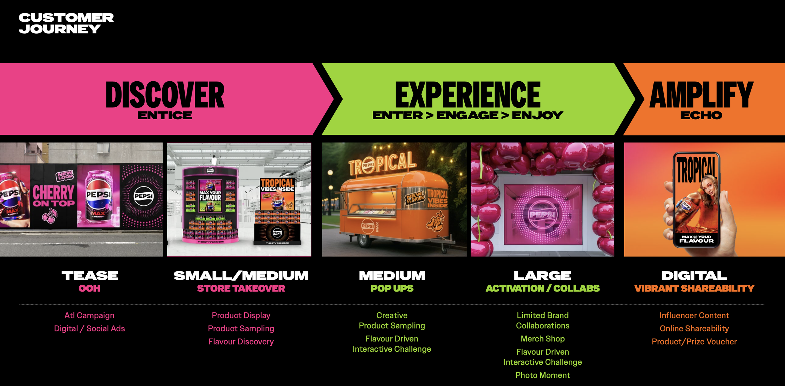
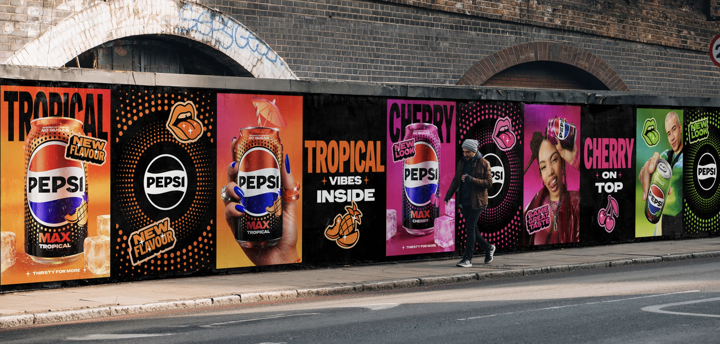
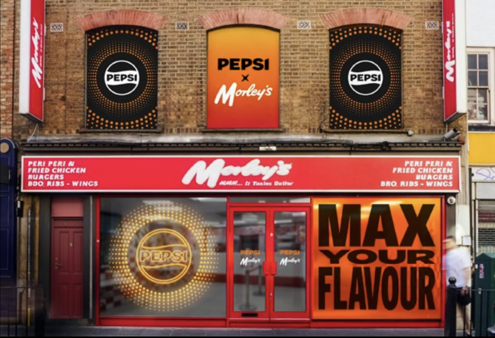
Example Designs and Real Life Execution
Creative Team
Luke Gillman
Hayley Shore
Sam Wall
Rui Granjo
Cristina Yang
Aoife Hastings
Harry Popaditch
Tom Macpherson
Corinna Hutter
Kira Roberts
with initial packaging support from Red Dot Studios and motion support from Rockabye.