
Introduction of New Innovative Packaging
A design-led exploration of glue-dot multipacks to reduce secondary packaging, using 3D, artworking and prototyping to pressure-test feasibility and create an on-pack system that still works once cans separate.
Objective: Explore a “snap pack” multipack concept that uses glue strips to reduce secondary packaging while maintaining shelf impact and usability, and future-proofing against tightening expectations around single-use plastic grouping packaging.
Why now: Sustainability + anticipated regulation pressure = reduce unnecessary secondary packaging, snap packs replace shrink wrap with adhesive dots
Goal: future-proof multipacks without defaulting to cardboard sleeves
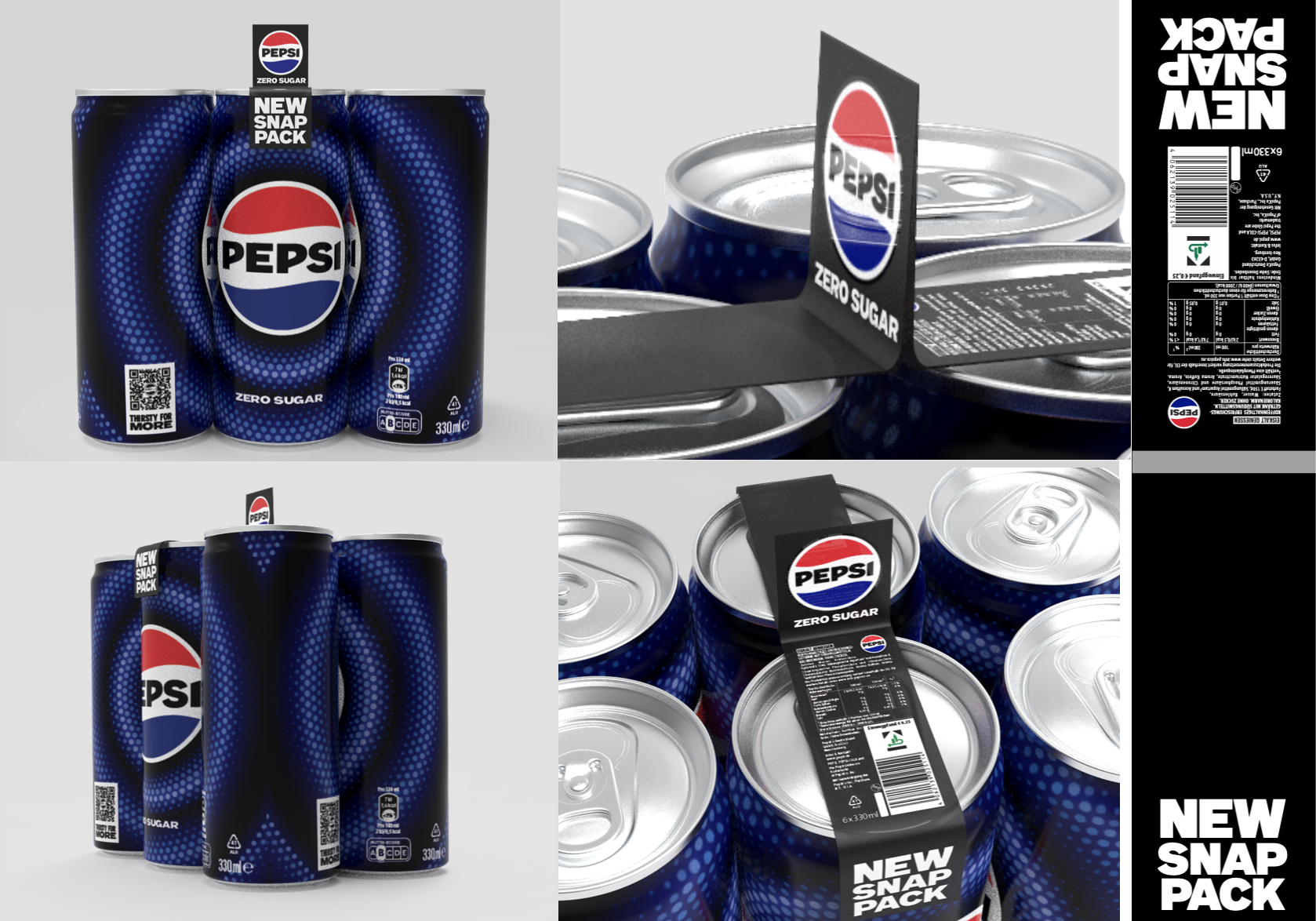
Task: Pressure-test the proposed pack artwork in real-world conditions (curved cans, rotation, separation into single units, mandatory information zones) and develop an on-pack system that still works once the multipack breaks apart.
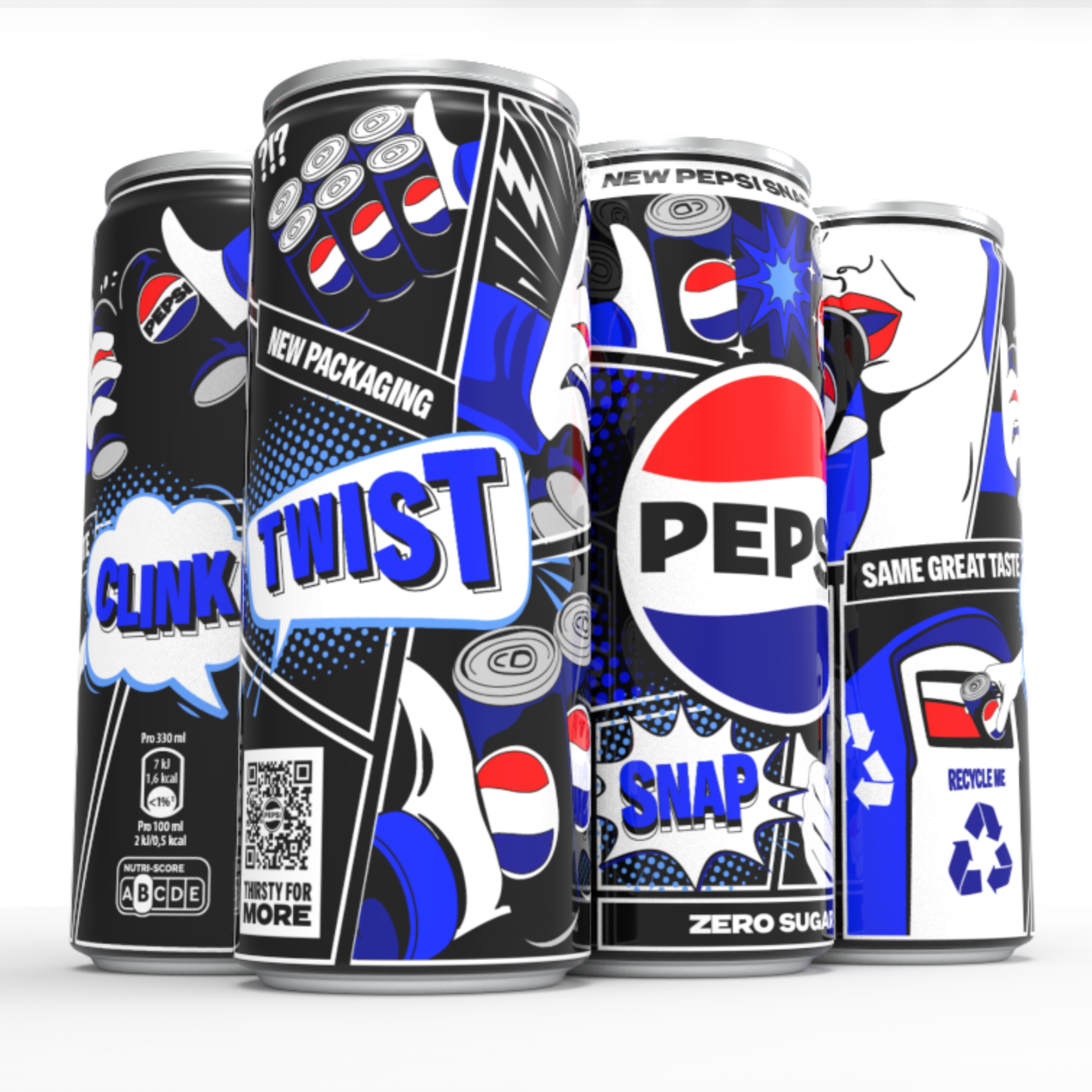
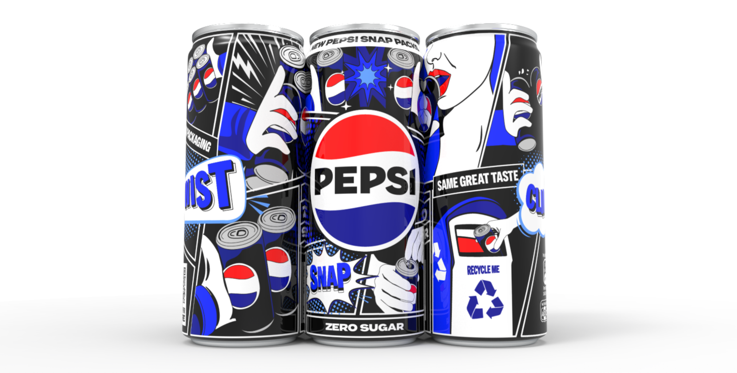
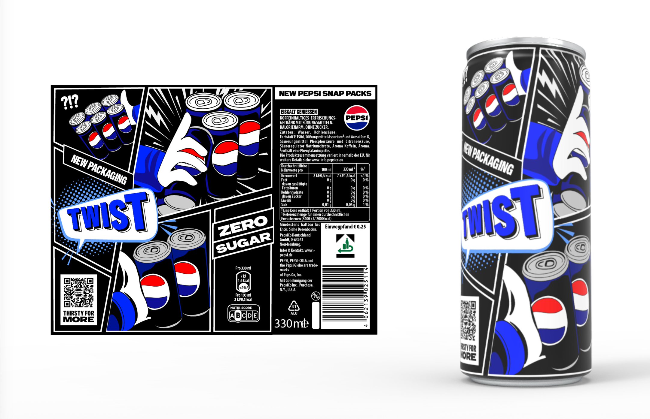
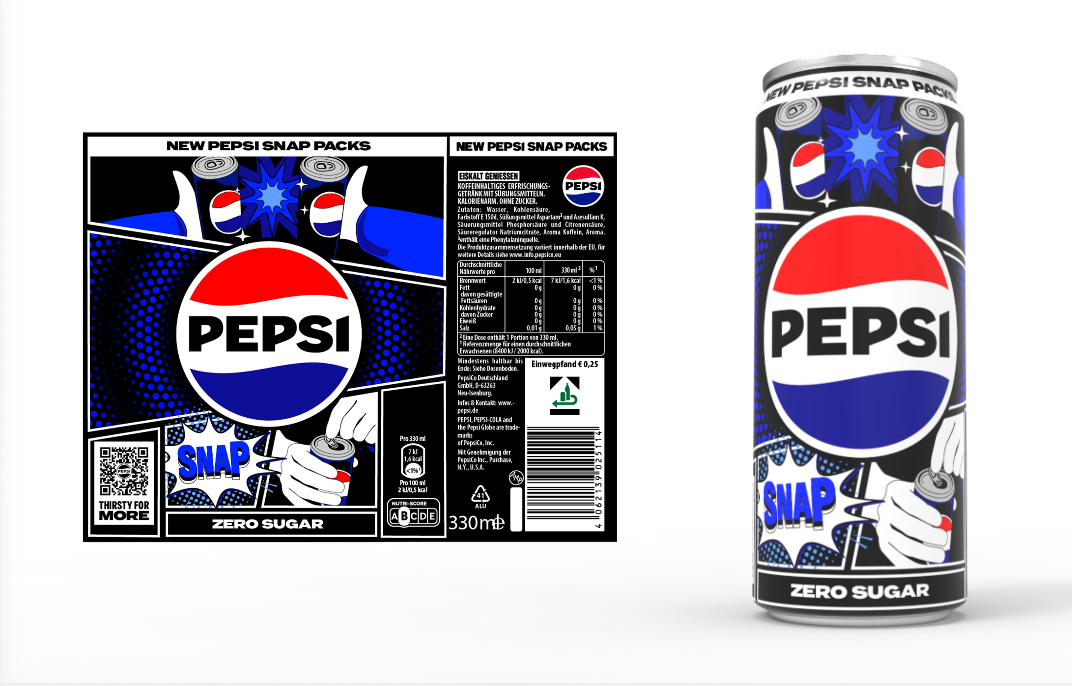
What I did: Built 3D turntables and motion tests plus a physical paper prototype to demonstrate feasibility issues to non-design stakeholders, explored multiple creative routes (including minimal packaging alternatives), and developed a final instruction-led concept (“Twist / Snap / Clink”) that forms a cohesive story as a multipack while keeping each can complete and on-brand as a single unit.
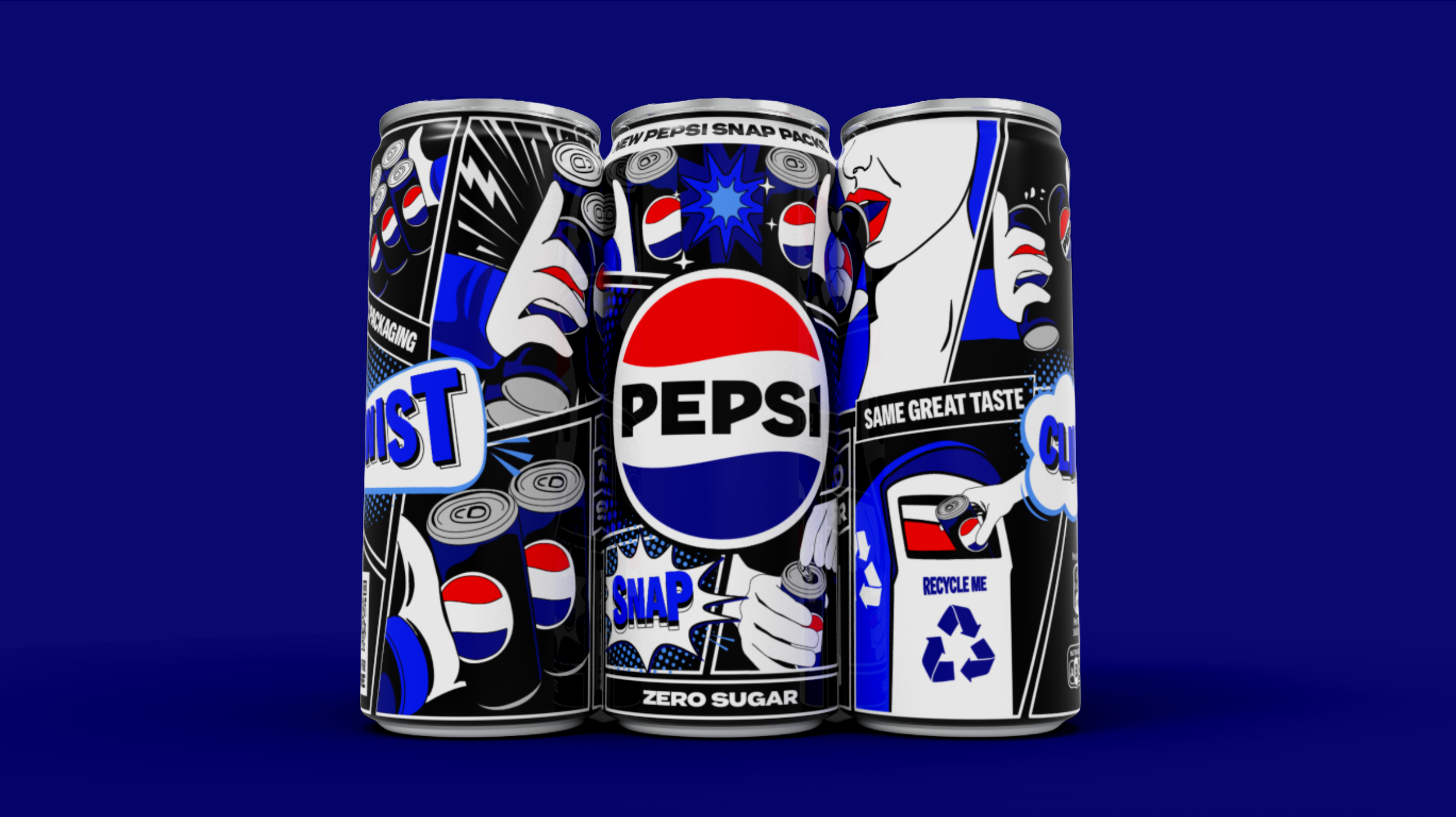
My Solution
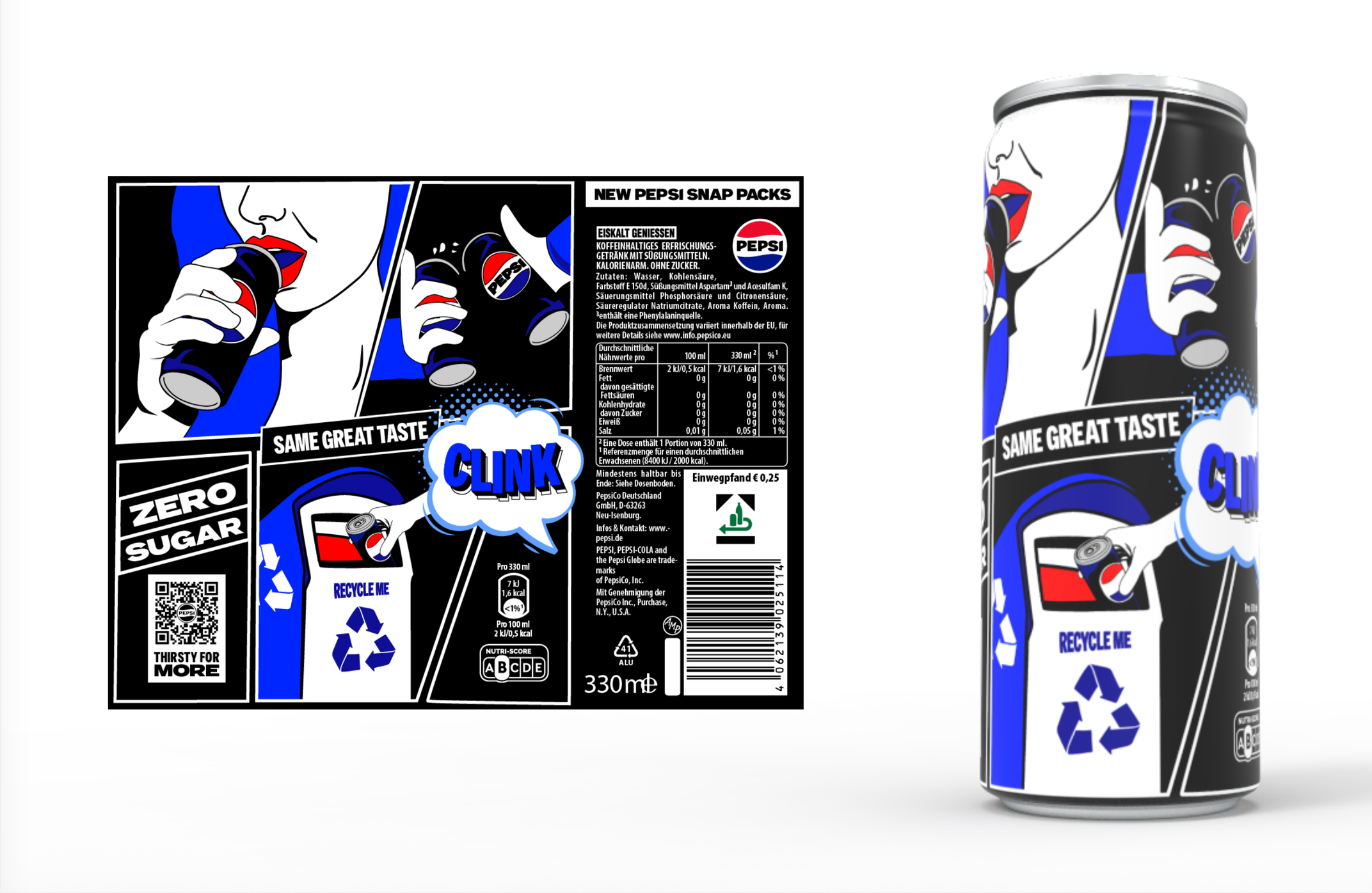
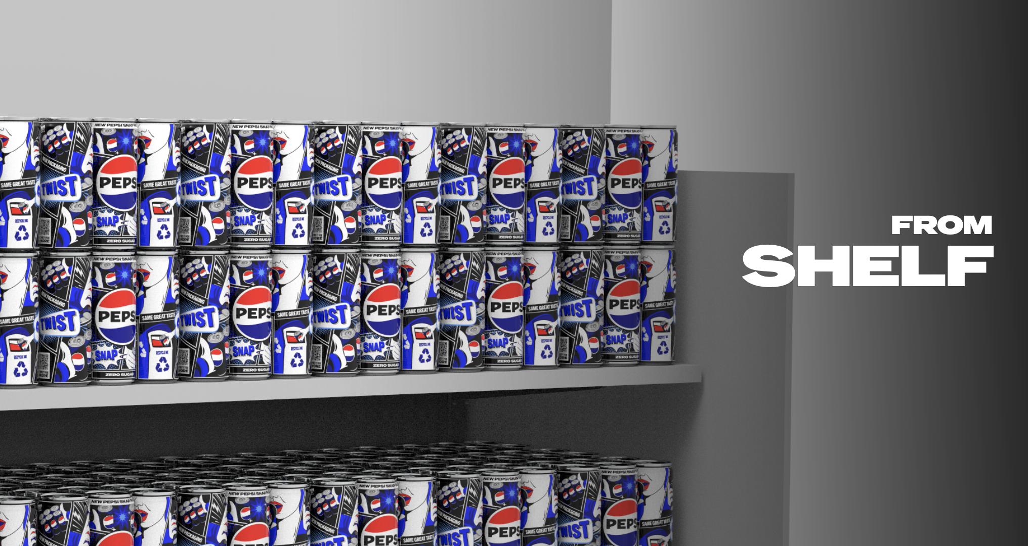
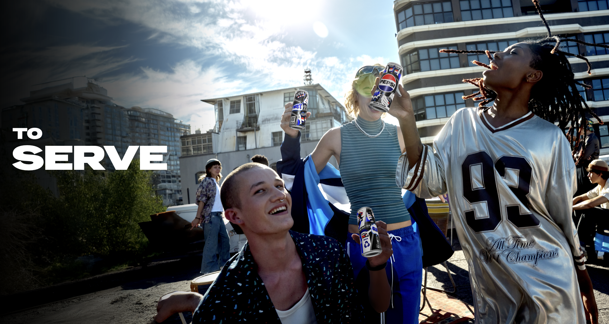
A modular comic-strip system, each can becomes a complete “panel” allowing them to have strength in their design when snapped apart, but together they form a larger story. The three-step narrative (Twist / Snap / Clink) let the cans do three jobs at once: introduce the innovation, show how to break the pack apart, and reinforce the recyclability message. The twist can informs of how to break them apart, the snap can infers to the noise they make when they break apart, and the clink refers to celebratory cheers action of tapping the cans together, and the sound of the can going into the bin after use. This also allows for a scalable campaign to be built around the launch of the can. This approach would work for an LTO launch, then return to the classic Pepsi single can artwork once the new innovation as been established within the soft drinks category. The visual style could be refined further, but the structure gives a flexible, scalable framework for launch that does not impact the necessary legal information, gives brand recognition and tells the story of the new innovation.
How did we get here?
Initial Concept
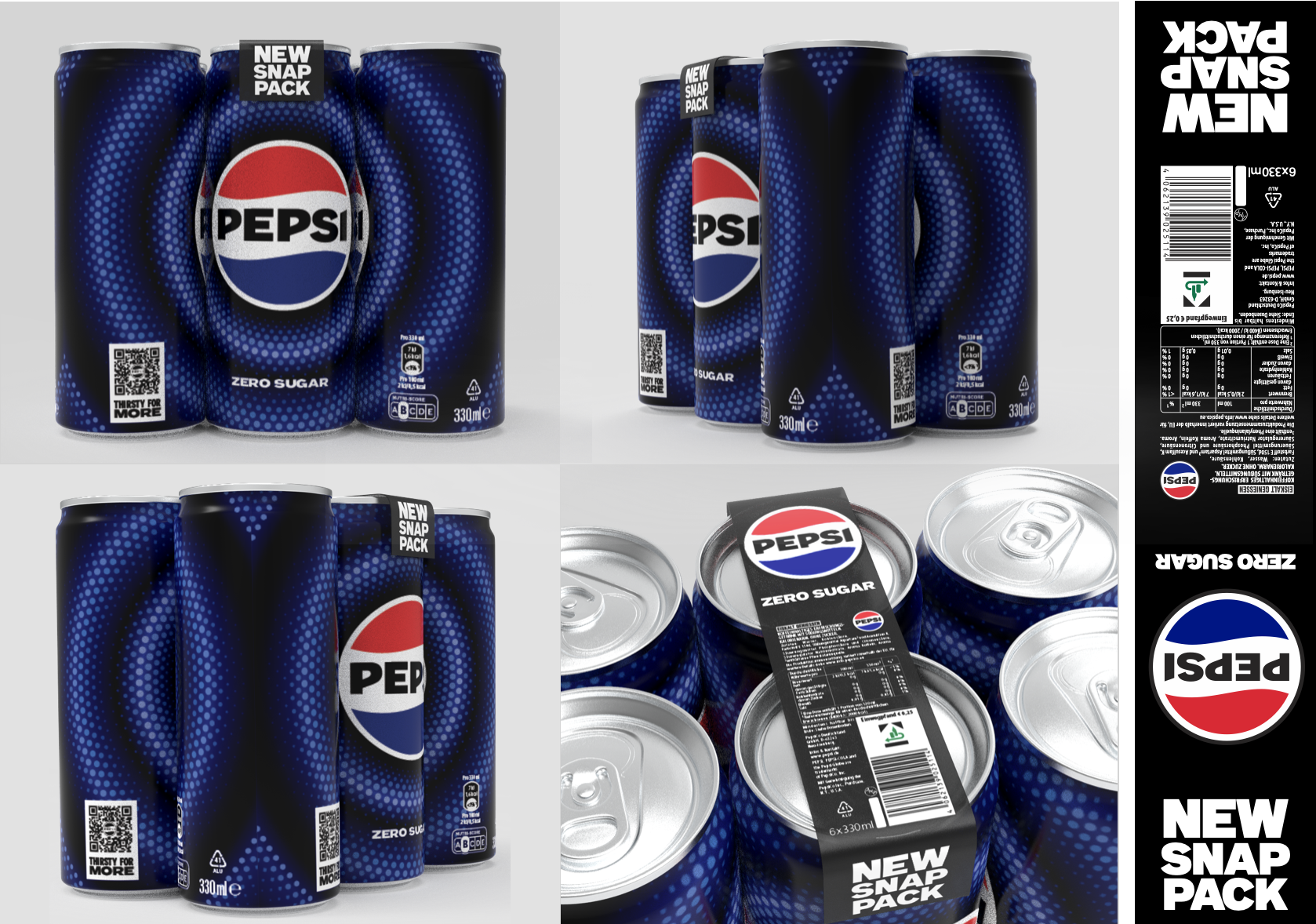
The first route aimed to create a single “billboard” moment across multiple cans. In principle it created strong impact, but it didn’t translate into a workable flat artwork layout. The can format has fixed requirements, brand hierarchy, nutrition/legal copy, barcode placement and seam considerations and the billboard approach either pushed essential information into the wrong areas or compromised key brand elements when laid out as a print-ready wrap. I mapped the concept onto realistic artwork zones and showed that the layout couldn’t meet both the creative intent and the mandatory pack requirements without breaking the design
Round 1
Removed nutritional information from pack and place on an additional label
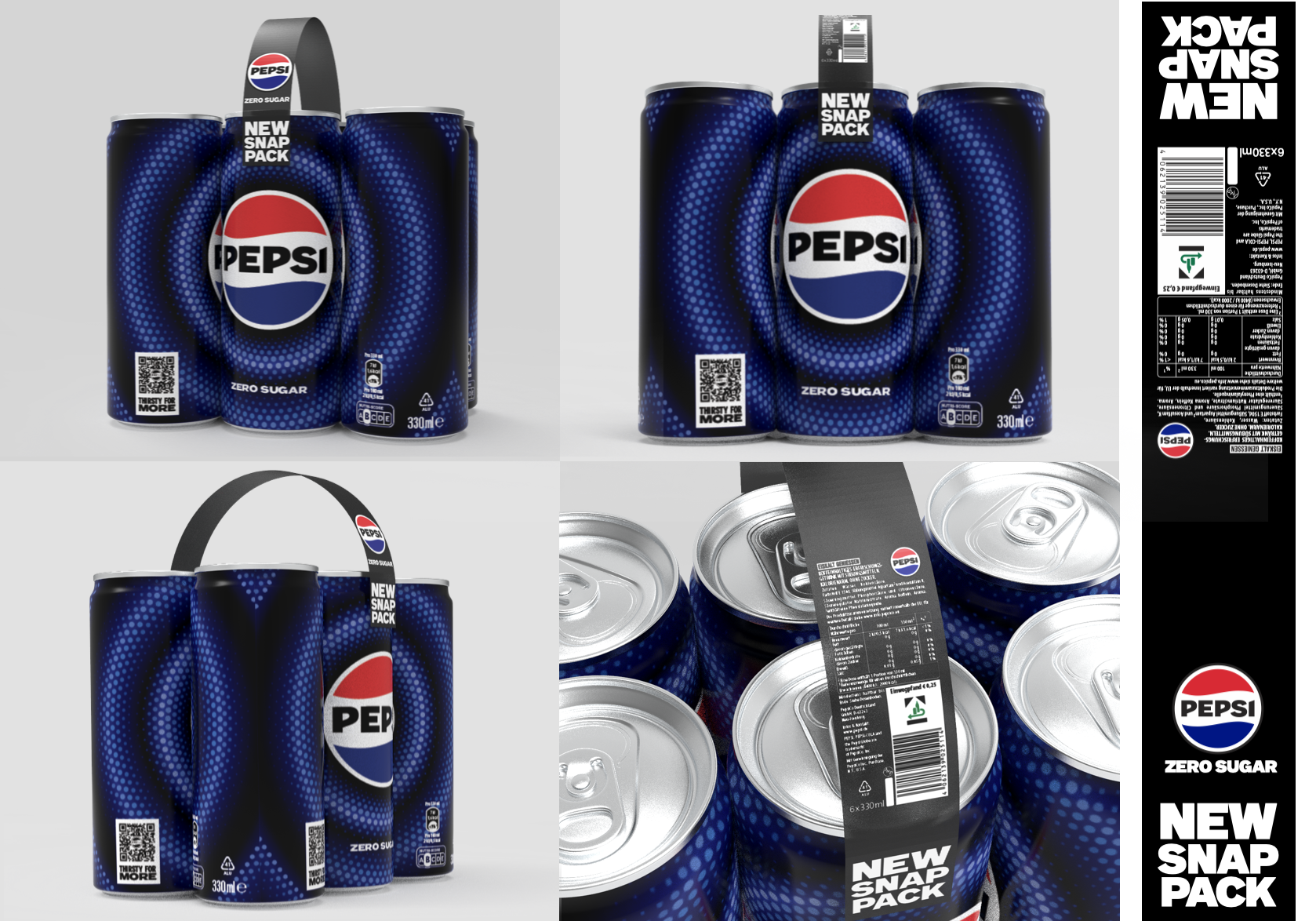
When the billboard concept couldn’t fit mandatory information cleanly on the can wrap, I explored moving key details onto a minimal paper component; tested as a carry-handle strip, a top strip, and a flat band. This freed up the can artwork for stronger impact while retaining compliance, and helped evaluate how the format could work with minimal added material. It was decided that additional packaging wasn’t an option, and could potentially cause concerns from a legal perspective, so I explored an artwork per can approach to keep the nutritional information on the back.
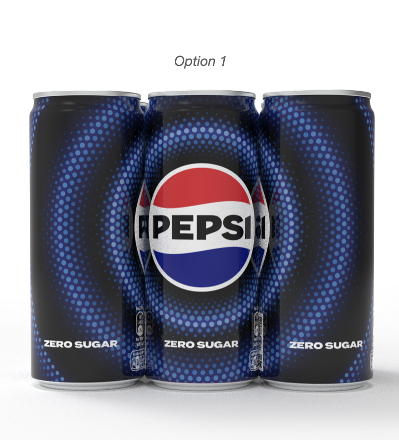
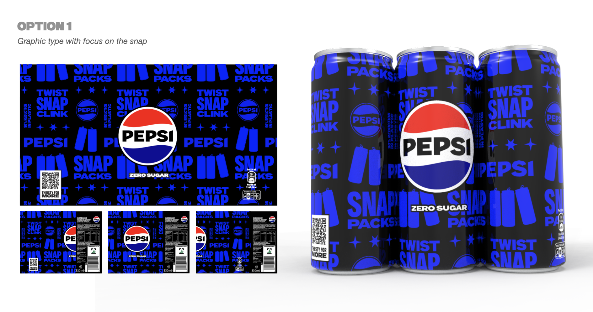
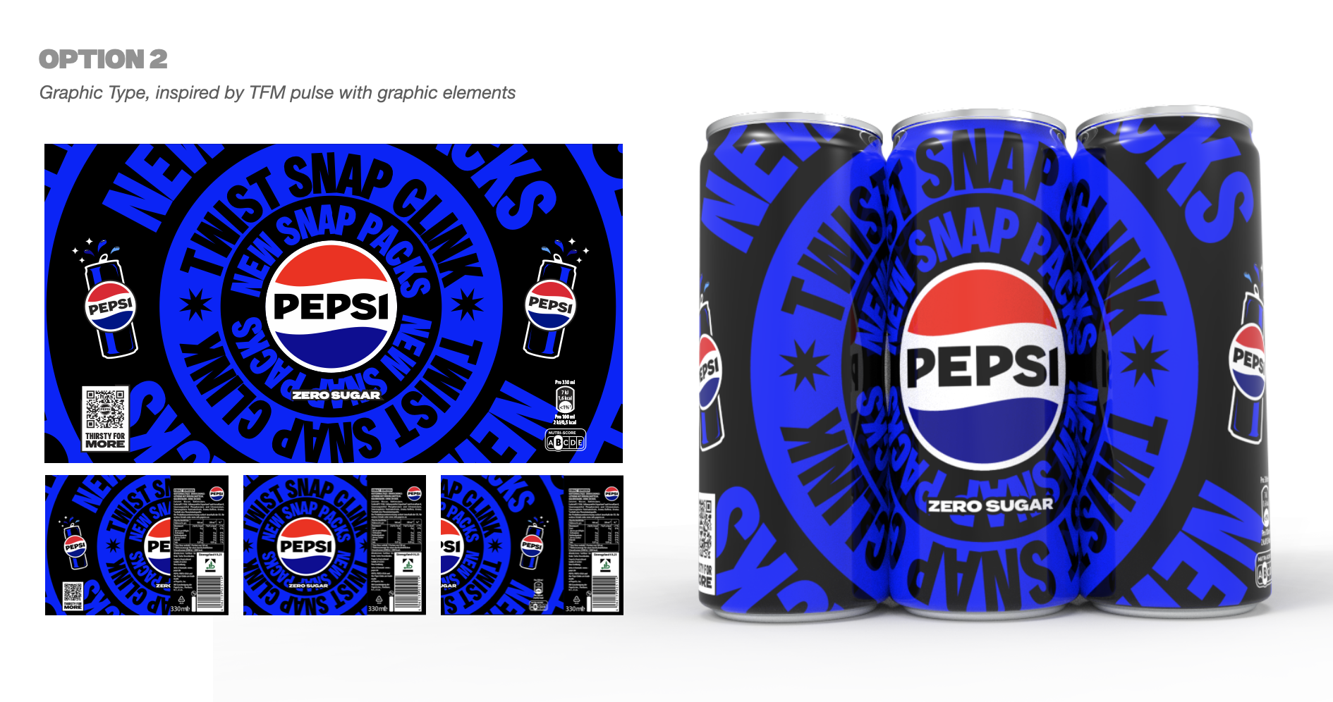
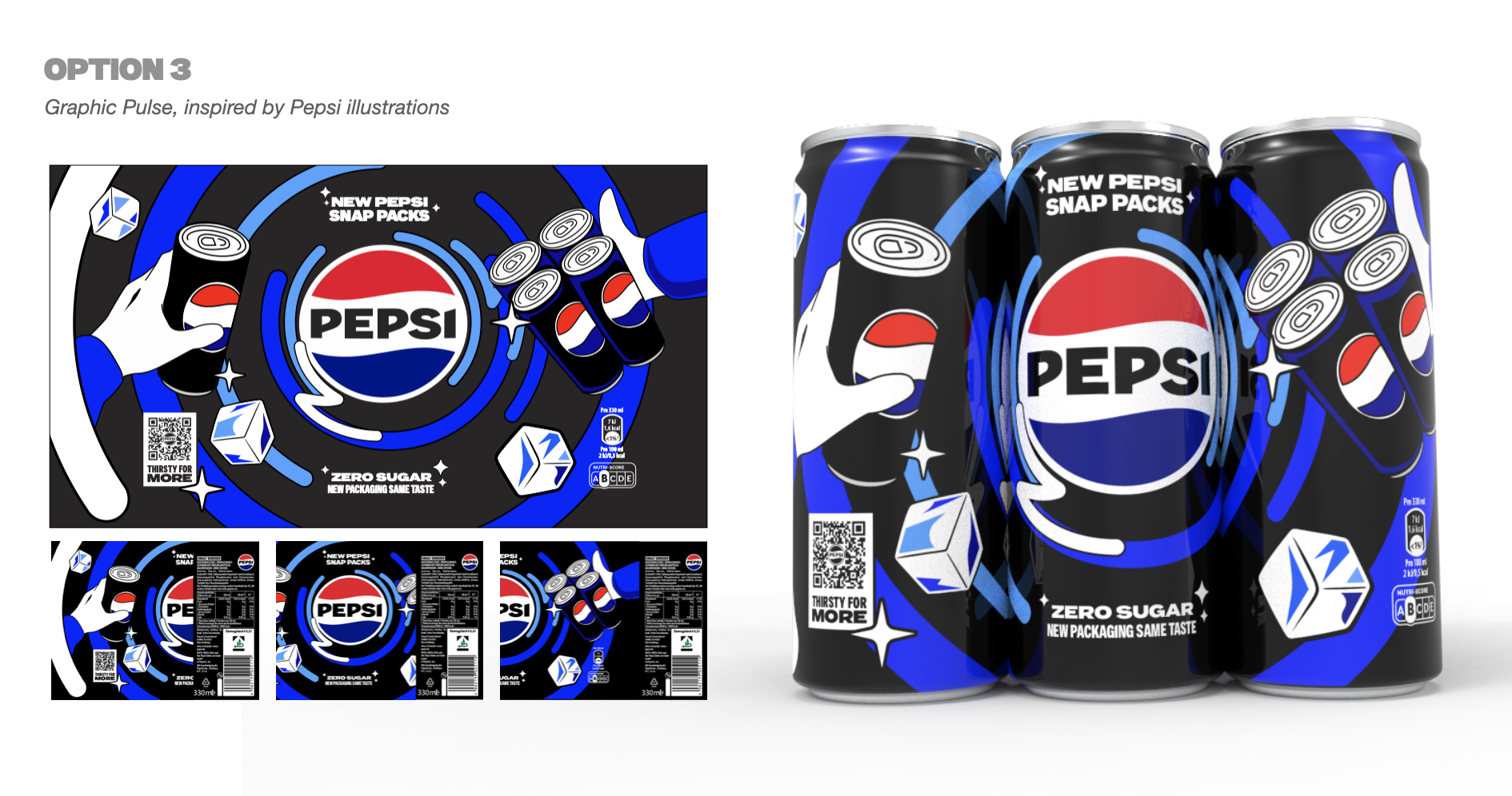
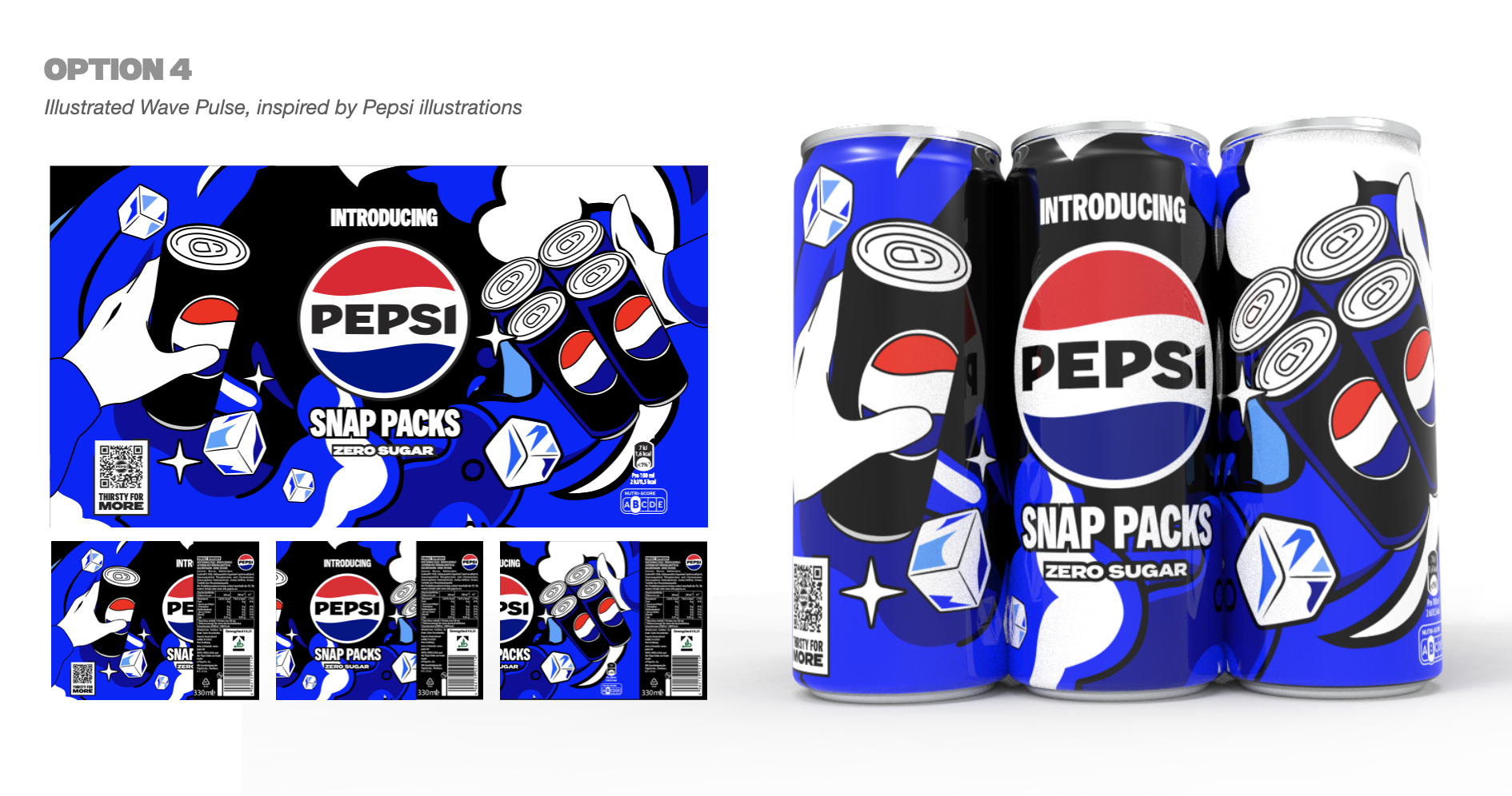
Option 1
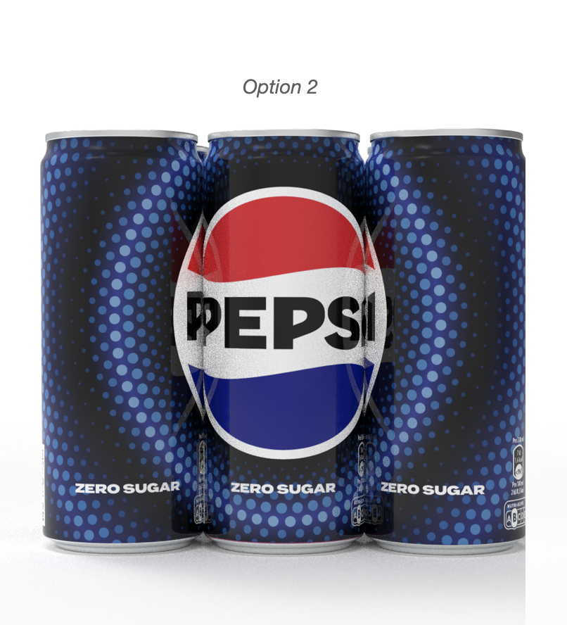
Option 2
Option 3
Round 2
Individual Artwork per can approach
I explored a per-can approach instead. In practice, this created new issues: the logo would be chopped or pushed off-front on most cans within a 6-pack, and attempts to scale the logo for impact didn’t hold up because the cylindrical surface warps and breaks the “front-facing” read across the pack. As there would be crop the logo on majority of cans, this approach was not going to work.
Round 3
LTO Launch Can approach
To make the innovation feel intentional (and avoid long-term compromises), we shifted to an LTO-led launch: Create a bold limited-edition design system to introduce Snap Packs, then revert to standard cans once the format becomes familiar. I explored multiple LTO design routes to find an approach that works both as a joined multipack and as individual cans.
Even with an LTO approach, the same problem remained: once the multipack breaks apart, each can becomes a standalone product. Several routes looked strong as a set, but lost impact and clarity as single cans. So I stress-tested every concept in “separated” form, not just as a multipack.
The Problem
Single Cans need their own story
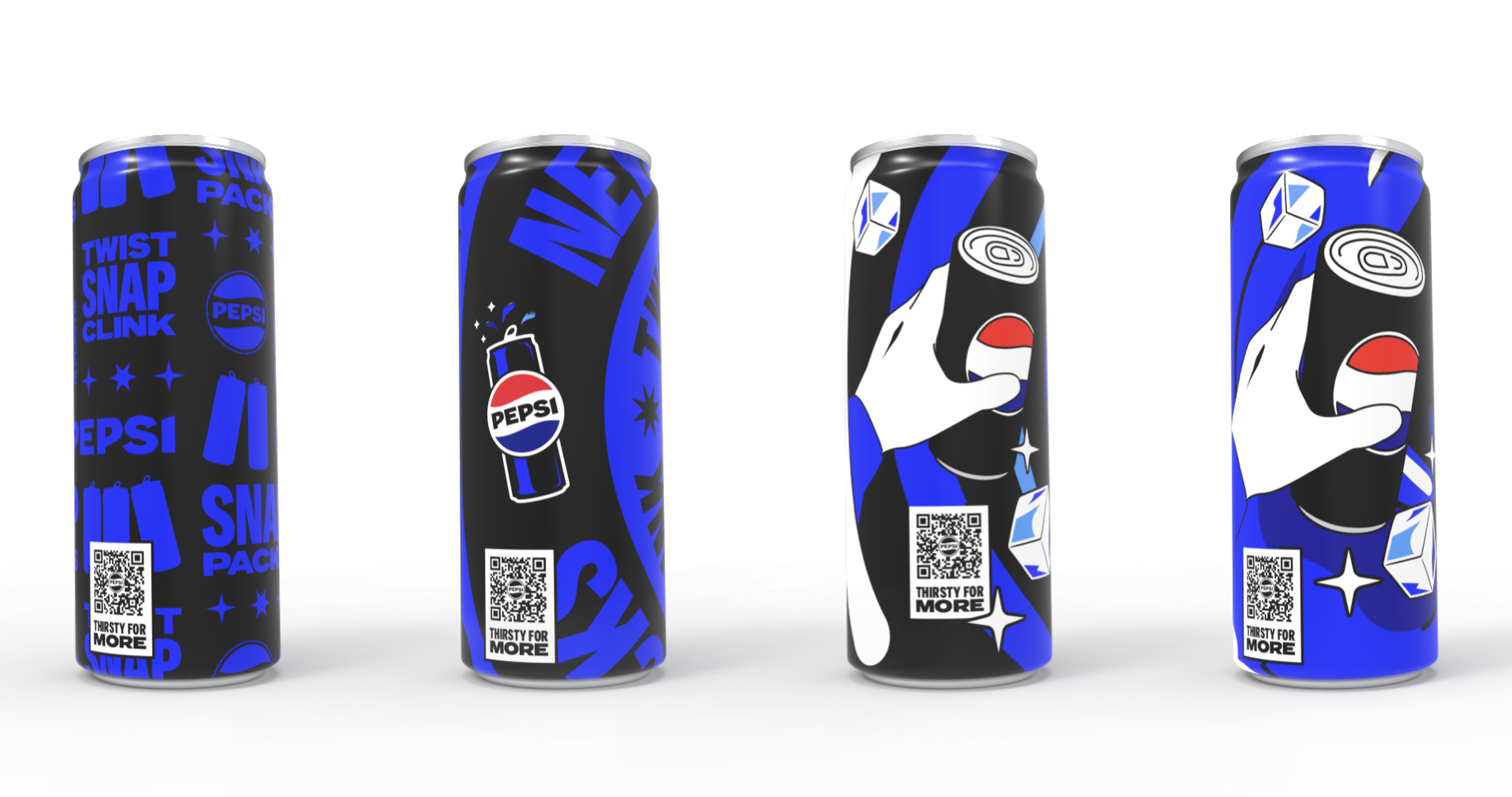
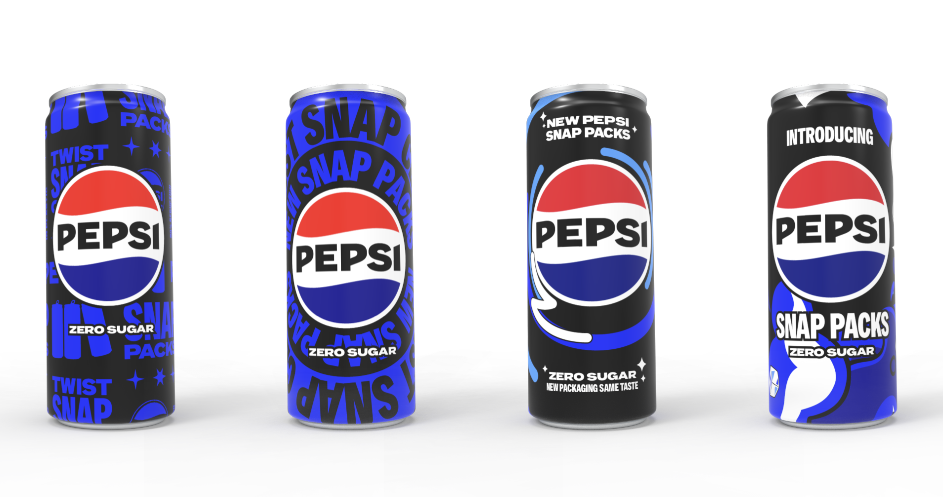
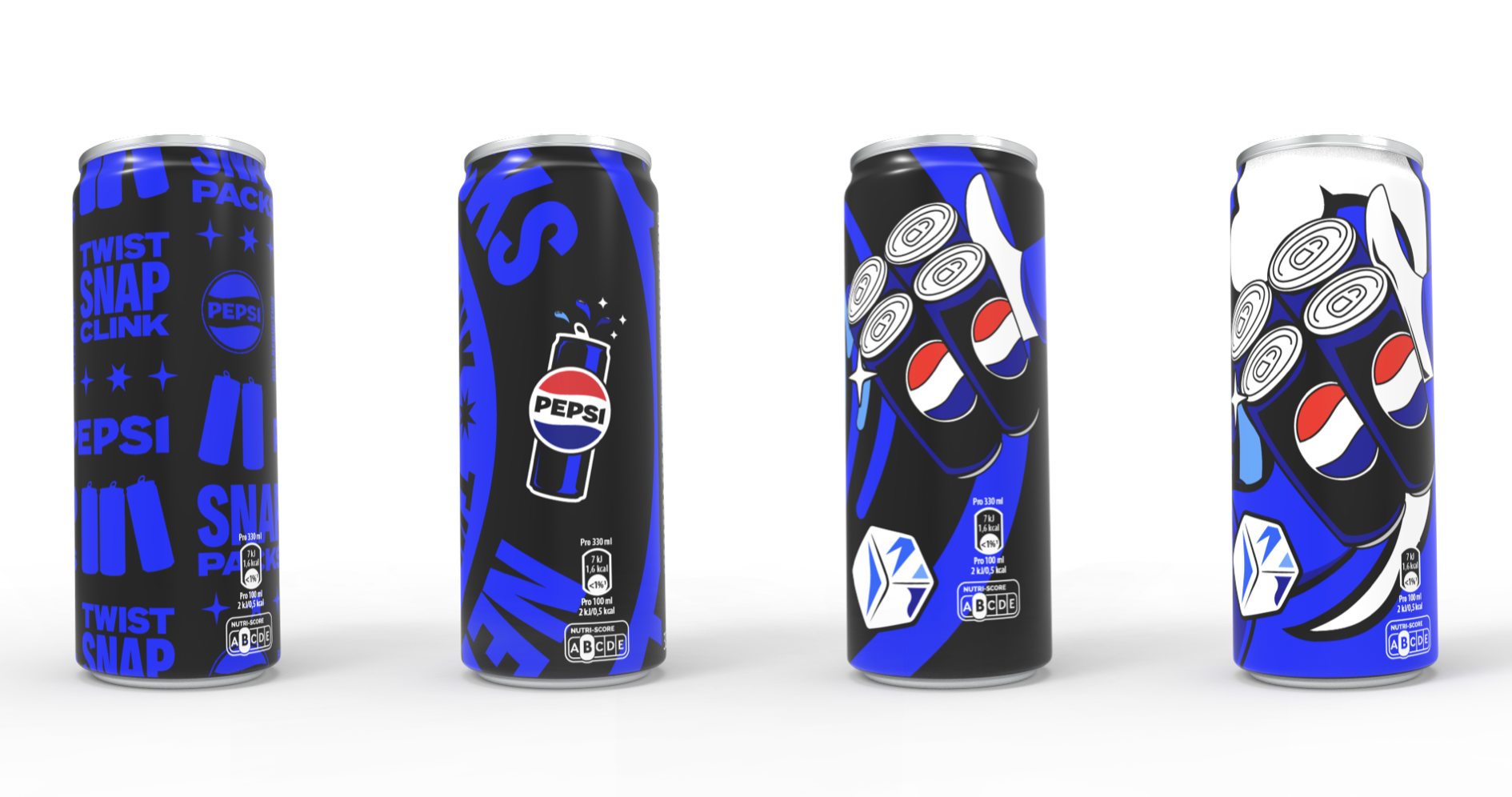
That’s when I shifted to a modular comic-strip system. Each can becomes a complete “panel” on its own, but together they form a larger story, making the design resilient once the pack is separated. The three-step narrative (Twist / Snap / Clink) let the cans do three jobs at once: introduce the innovation, show how to break the pack apart, and reinforce the recyclability message. The visual style could be refined further, but the structure gives a flexible, scalable framework for future LTOs and formats.
Although this concept didn’t move into production, it was a valuable exercise in feasibility-first packaging design. It reinforced that strong ideas have to survive real constraints; mandatory information, brand hierarchy, curved surfaces, and the reality that multipacks don’t stay intact. By testing routes quickly in both flat artwork and “separated can” scenarios, I was able to steer the work toward a solution built for real use: a modular comic-strip system that communicates how the innovation works, how to separate the pack, and recyclability, while remaining complete and on-brand as single units. If I were to take this further, I’d explore a refined illustrative route that still breaks into three so each can tells its own moment, but together they build one larger story across the pack.
Creative Team
Hayley Shore
Kira Roberts