
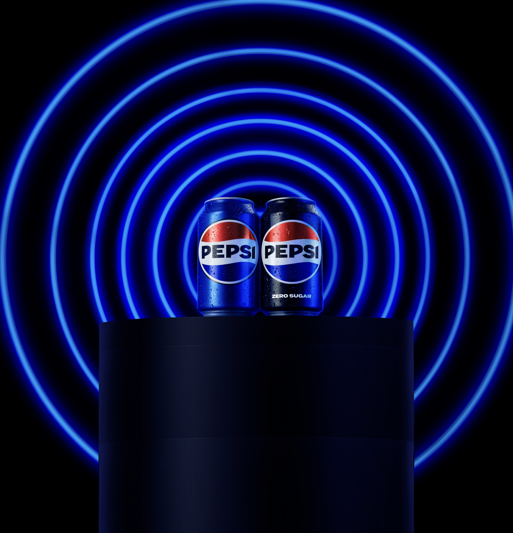
Hero Animation (Art direction & Storyboard by myself, 3D animation production with Yatta).
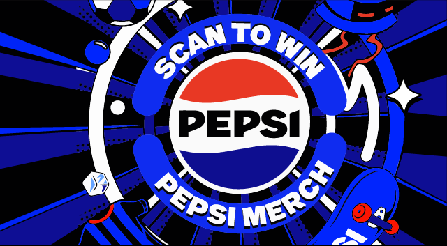
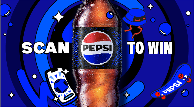
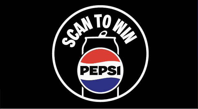
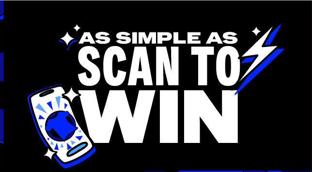
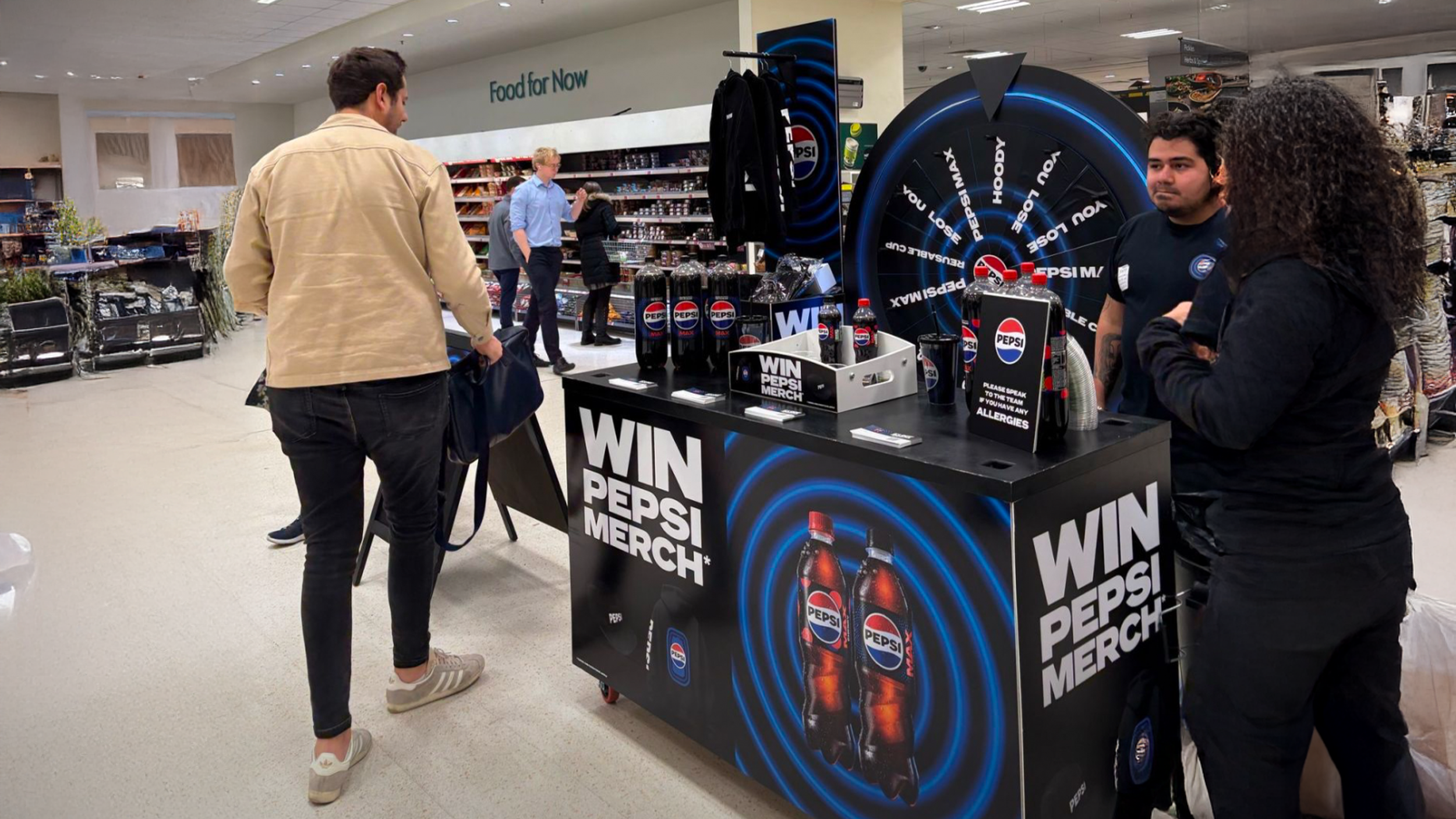
WIN PEPSI MERCH
Amplify the Pepsi Global Redesign with a limited-time merchandise competition
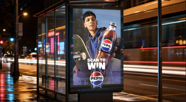
A UK-wide scan-to-win promotion designed to build momentum for Pepsi’s refreshed identity and drive participation on the Joy platform. Over a four-month rollout, I helped shape the campaign’s visual world and led delivery of a scalable toolkit system from merch design and KV modular rules to 3D store visualisation, partner guidance, and art direction of motion assets, enabling consistent execution across retail, trade, hospitality and digital placements.
Overview
Pepsi had just launched its updated visual identity in the UK, and this campaign needed to extend that world with minimal budget while increasing shelf presence and participation. The mechanic was simple: scan on-pack QR codes to enter via the Joy platform for a chance to win Pepsi merch.
My role
• Explored, researched and developed three KV world routes (illustration, lifestyle, hybrid neon approach)
• Co-built the final KV system with a colleague and translated it into a modular layout architecture (headline / product / merch / supporting line)
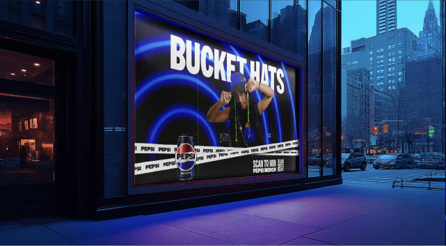
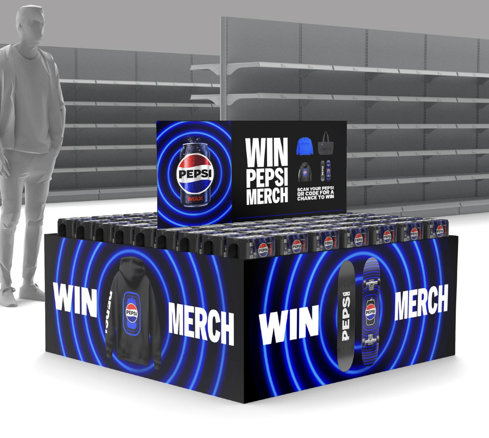
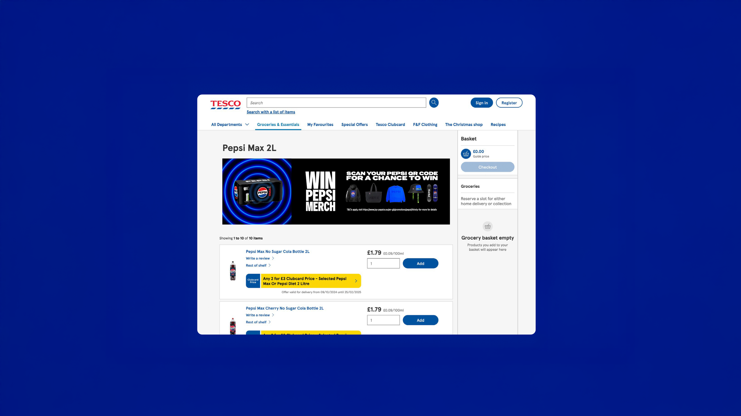
• Led creation of a 75-page shopper toolkit including a 3D-modelled store environment and 25+ application examples
• Art directed an external motion agency (brief + feedback + approvals)
• Supported governance and rollout approvals with internal teams and external partners over ~3 months post-launch
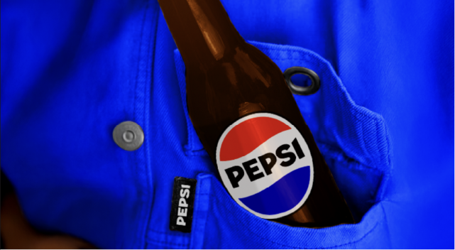
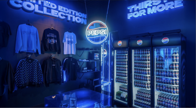
• Designed and developed the core merch collection, ensuring it felt culturally relevant and consistent with Pepsi’s refreshed identity. (Some of which were used within this campaign)
How we did it
KV Design World Exploration
I explored three distinct KV worlds to find the most effective way to build on Pepsi’s refreshed identity. One route was illustration-led, inspired by the Pepsi Titan mural style to create bold, graphic energy at shelf. Another was a lifestyle-led approach, built around a photoshoot of real people wearing the merch to connect naturally with Pepsi Meals campaign cues. The third explored a 3D-led world, leaning into the under-used blue neon pulse language from the Pepsi toolkit with more fashion-inspired lighting and styling. These explorations helped clarify what could be delivered at pace and at scale, and informed the final modular system.
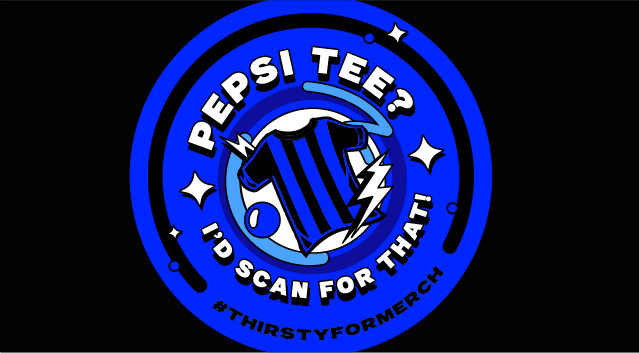
Concept 1: Illustrative Approach
This design system is based from the Pepsi Murals that launched to support the New Pepsi Visual Identity 2024. Taking some of the core principles and applying them to this campaign would allow for a low cost approach to minimize the need for many additional photograph assets, but can be adapted for it should the budget allow it
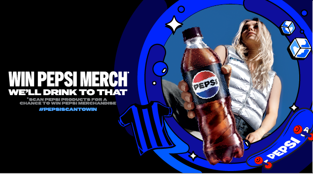
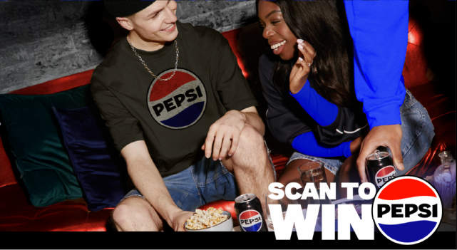
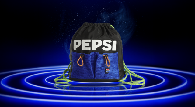
Concept 2: Lifestyle Approach
Stemming from the Pepsi Meals campaign, this concept really heroes the consumer and merchandise in a way that makes it feel relatable making it more desirable. It utilizes many similar assets already created so it would feel close to the new visual identity, but would cost more to execute due to the heavy reliance on photography.
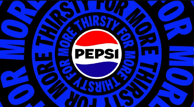
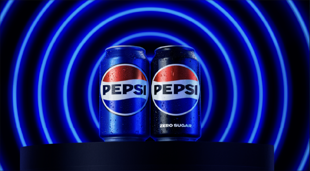
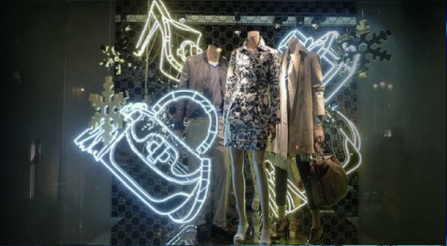
Concept 3: Neon Lights Approach
This approach focuses on using a pulse which is not commonly used but is a core element in the new Pepsi identity system and makes it the core element for the campaign. Using neon lights to also cue fashion brings together a lifestyle approach with potential elements for illustration through neon signage. This particularly works well in relation to any experiential pop-up activations that may also link to the campaign as exhibited in Pepsi’s Nordic activations.
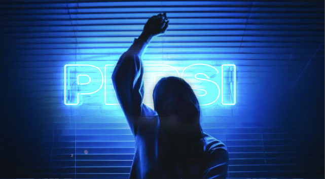
Concept 3, the neon lights approach was chosen to go forward due to the link to use of an existing pulse which links well into fashion and experiential design. Stakeholders deemed this the most flexible due to the nature of it flexing with illustration, lifestyle and a hyper-realistic black and neon world.
Next steps was to build the key visuals to use within shopper than can be rolled out with agencies across the UK.
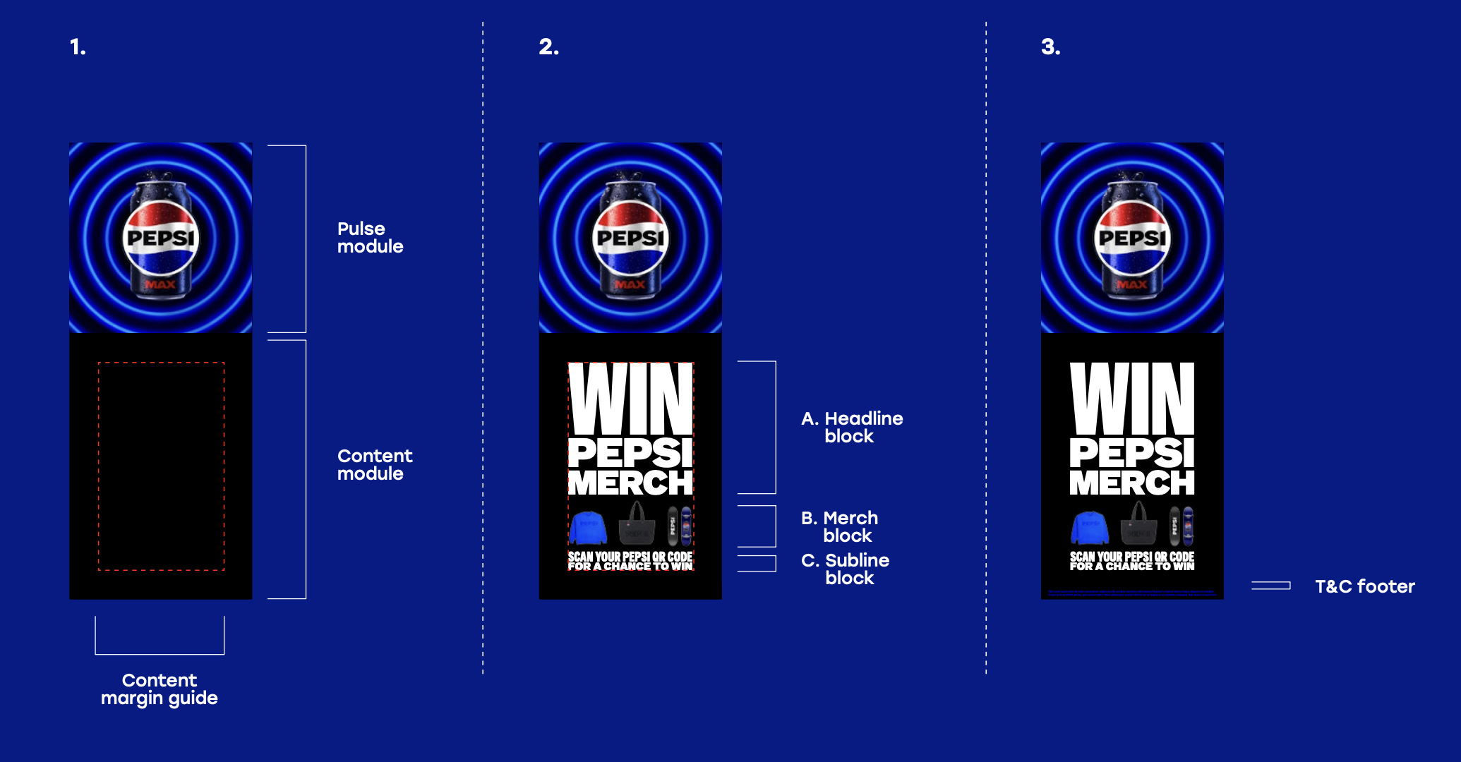
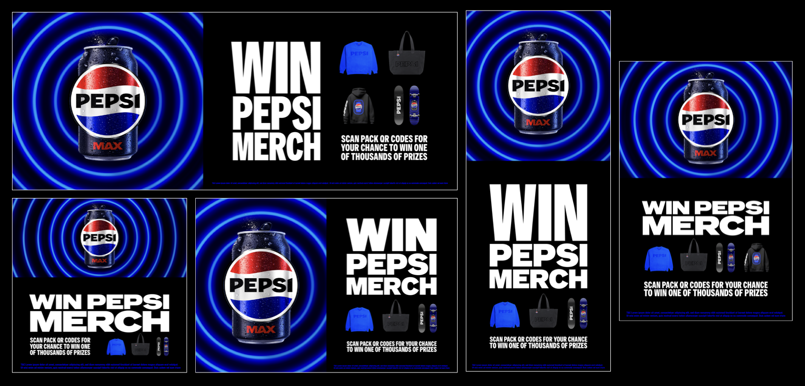
KV Design System
The KV was designed as a modular block system so rollout partners could adapt quickly without breaking hierarchy:
• Pulse remains the dominant brand device
• Clear spacing rules and hierarchy prevent clutter
• Flexible compositions allow either the product or merch to be hero depending on placement of KV
Common pitfalls were managed through toolkit guidance and approval feedback (e.g, ensuring sufficient whitespace and maintaining pulse prominence).
Toolkit and Rollout enablement
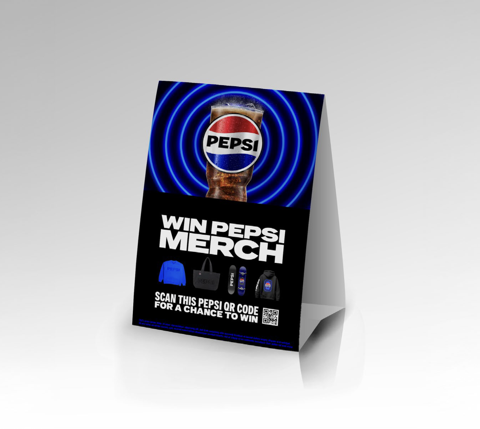
To scale the campaign across formats, we created a comprehensive toolkit that included:
• core KV build rules and asset pack
• product-led and merch-led layout options
• retail/trade/hospitality examples (FSDUs, gondolas, WOW displays, table tents, CDUs, digital banners, etc.)
• a 3D store mock environment to visualise placements before production
• ongoing partner support: weekly check-ins, email guidance, and approvals
Production realism
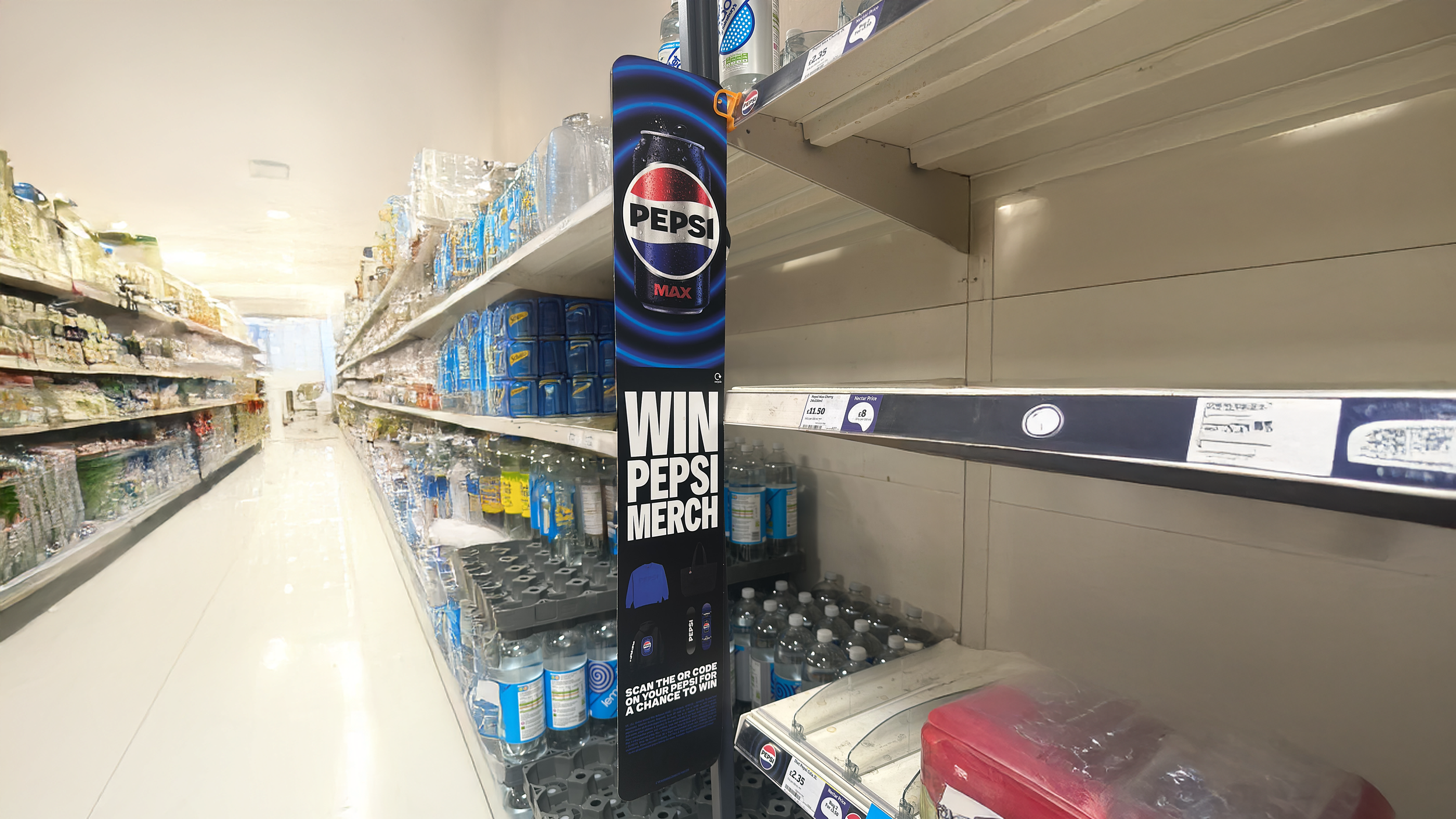
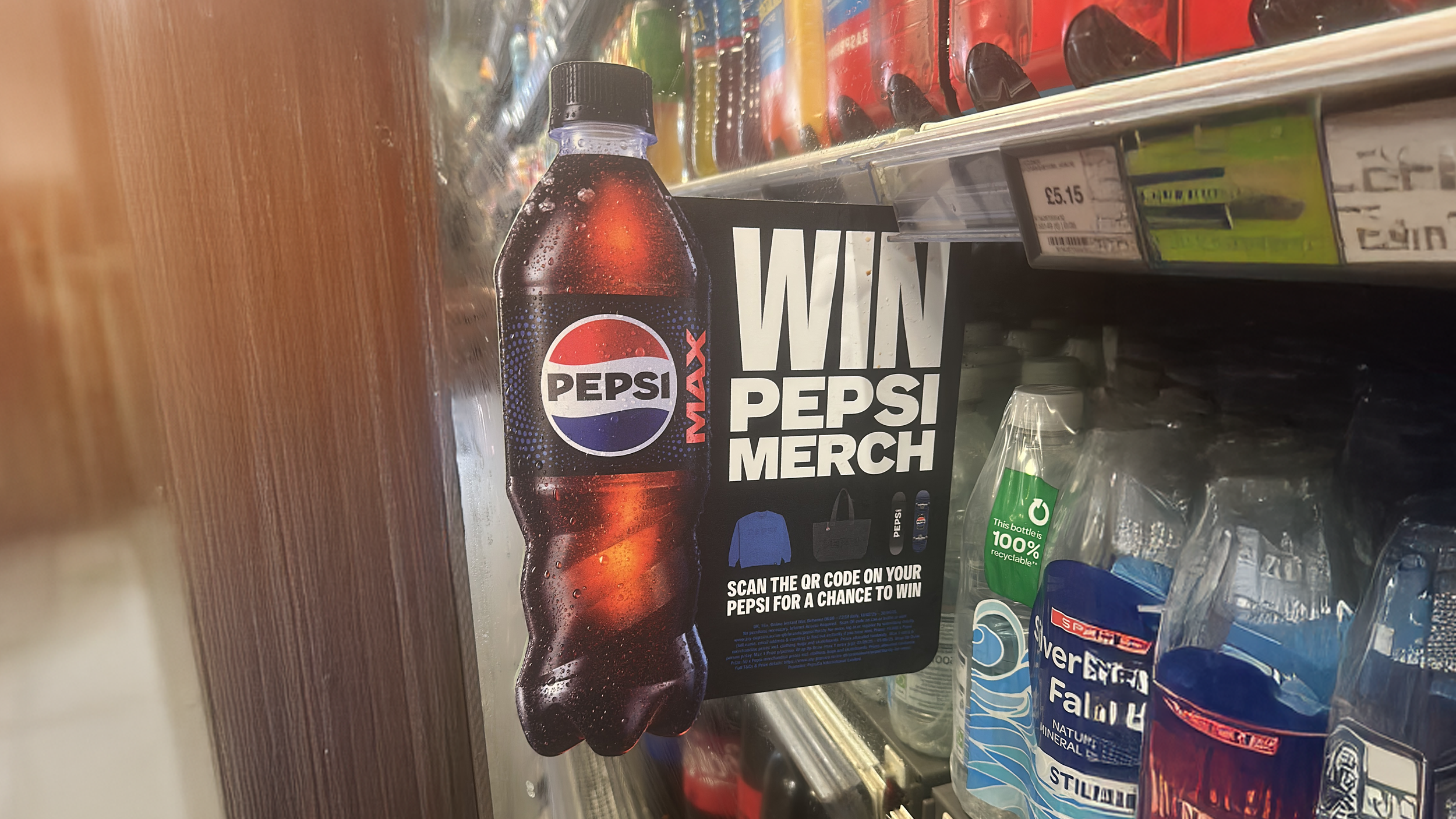
One thing we learnt was that due to the scale of the project, many designs did not get approved through us such as specialized die-cut key visuals like this one. This would not have been approved by senior design stakeholders as it is missing the ‘Pepsi Pulse’. However, it’s clear they followed the hierarchy guidance that we had listed above though and I think it is still in keeping with the rest of the campaign.
A key production consideration was colour reproduction, particularly Pepsi blue with a gradient to achieve the neon lights in CMYK. I worked closely with our artworker, Hugo, to ensure the gradient printed accurately across outputs.
Motion Art Direction
To extend the campaign into digital, I wrote the motion brief, art directed and helped guide the overall composition, loops and cutdowns detailing:
• floating merch in a premium Pepsi world
• controlled pacing and camera language aligned to the pulse
• texture accuracy (merch created from our designs) and brand compliance
• sound direction to match tone and energy
I then worked closely with a 3D Animation Design Studio, Yatta, to execute this concept and fine tune it based on our knowledge of the Pepsi Vis world.
We exported a 1:1 (square) master asset, but composed the animation around a central ‘safe’ area that overlaps both 16:9 (landscape) and 9:16 (portrait). By keeping all key action within this centre crossover point, the video could be cropped for either format without losing important content. This makes the asset far more usable across, socials, shopper, activations and beyond.
Creative Team
Luke Gillman
Hayley Shore
Sam Wall
Hugo Lees-Jones
Kira Roberts
with Agency support from ‘Not Just Clothing’ and ‘Yatta’